
I first met Chris Costan years ago, back in my temping days. Sent by a staffing agency to meet her at Eileen Fisher, I was the potential replacement for her assistant, who would be out for a few months. At the time, I had a long-term gig in place, and I was afraid to give it up. Walking away from the chance to work with Chris was not easy — I knew that she was someone I could really learn from. In addition to being a color designer, Chris is a visual artist with a career spanning decades.
The work table.
I remember being deeply impressed by her workspace, known as the Trend and Color Studio. A wild mix of images, textures, unusual objects, books and color swatch cards with handwritten notes. There was a softness and tactility to it, a thoughtfulness. I hadn't yet seen an inspirational space so fully realized in a fashion studio.
Years later, it turns out that I now work in the same building as Chris. After a re-introduction by her coworker (Thanks Maggie!), I asked Chris if I could photograph her current studio. She gave me access to her workspace, generously answered my questions and shared commentary on some recent pieces from the Eileen Fisher lookbook.
Color palettes in process.
Color swatches organized by hue.
Trend books.
Library of color swatches and samples.
Q&A with Chris Costan

Self-portrait provided by Chris.
As a visual artist, how did you start out working in color design/fashion?
Having the experience of a life in fine art, I had the needed knowledge, cultural awareness and expertise to be able to design color at Eileen Fisher. I have, by nature, an aptitude for fashion and trend. The job also requires a great deal of organizing and multitasking. All that said, I was referred by another artist who was familiar with my skill set. Helen Oji, also employed by Eileen Fisher.
How has your work at Eileen Fisher informed your personal work as an artist?
The two disciplines of my job as color designer and my own personal work are separate but equal. In other words, there is a great deal of cross pollination between my job and the artwork. And that's a wonderful thing, because each is the richer for it. As an artist or a designer, one takes in the world around, absorbing and applying that which is seen, heard or learned. At the same time I am always aware of keeping the fashion/design-y portion at bay in the art practice. Let it in, but not too intensely. I have been influenced in my own work by material usage. Always having had an affinity for fabric, textiles and associated decorative notions, I've seen that these materials have become more integrated into the art as I have progressed. And I often procure excess materials that are discarded in the design studio and use them in my own personal studio.
Has it changed the way you see or apply color?
Necessarily, yes. I love the vicissitudes of trend and am more acutely aware of them as it is a part of my responsibility in the job. I constantly look at the way people on the street dress and, in my mind, rework how they have put color (and styles) together. I also worked at MTV Animation for a while and was responsible for color on Daria. During that time, I would ride the subway looking at hair colors, shoe colors and general color styling in order to apply those combos to the show. Based on my descriptions, you can see how ALL is factored into the mix.
Eileen Fisher is known for being understated. How do you incorporate color trends into your work? What are the challenges?
Eileen Fisher clothing alludes to trends, as opposed to adhering to them. We are interested in elegance and wearability in the clothing. In the design department, we digest and interpret the trends and synthesize which trends mesh with the brand. I make great efforts toward incorporating important and current trending colors while building an aesthetically beautiful palette. Factoring in the sales and wardrobing needs of the brand are also essential. The job itself is challenging, but incorporating trends with discretion is simply a matter of prioritizing which main trend ideas can be used within a season.
Eileen Fisher is known for its neutrals as well as the distinctiveness of its colors. Therefore I am perpetually thinking about interesting color combinations which appear within a delivery or a season and how they will mix together visually, either in the store or on the body. I mix colors so that they can be worn with each other, or with the given neutrals. My preference is to mix a color with neutrals. But the other way works as well.
What is most rewarding about your job as a color designer?
That cross pollination I was talking about above. In addition, the pureness of aesthetics within my role at Eileen Fisher. As an artist, this is a wonderful job.
What is your favorite object in your studio?
Everything, because the objects, the wall images and the palettes are all a source of inspiration. My eye alights on something ... an object, a picture, or a building, and I immediately get ideas.
I understand Eileen Fisher is working towards responsible dyeing as part of its sustainability initiative, Vision 2020. What does sustainability mean to you? How do you apply those principles in your work?
Sustainability is paramount to the Eileen Fisher brand. In 2016 almost half of our dyes involved the use of safe chemistry. I do feel lucky to work for a company that tries as hard as it can to have a positive effect on the environment. We do feature some natural dyes in our accessories and utilize natural undyed cashmeres.
In the past, in my role as color designer, I felt strongly that as a brand, we should be working toward offering some naturally dyed garments. A natural dye pod will be featured in some retail stores in April 2017. It is difficult to use natural dyes for a company this large, as many of the colors are fugitive by nature. But the use of natural colors is intriguing and is linked to preserving cultural traditions.
What works of art have inspired you recently?
Lots. Kerry James Marshall at the Met Breuer, Raymond Pettibon at the New Museum, Katherine Bradford at Sperone Westwater Gallery. Bonnie Lucas's little retrospective at JTT Gallery, and scattered pieces I've seen of Judy Simonian's paintings recently. Also, frescoes in the Shekhawati region of India that I saw on a recent visit to that country. Always, the architecture of parts of India. All inspiring.
Are there any colors on the rise that you love? What's your favorite color of the moment?
I often like colors which are trending. The cosmetic colors/skin colors have been styling for maybe 4-5 years and going strong. I like those paired with neutrals and am a fan of blues and pinks.
Below, Chris shares her thoughts on 5 recent looks from Eileen Fisher.
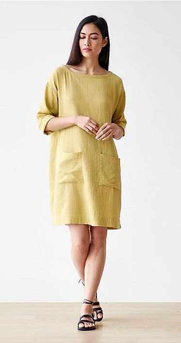
FROM LEFT —
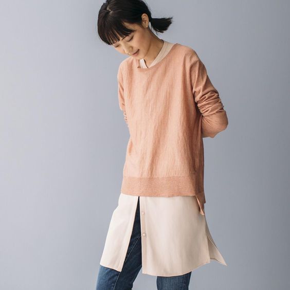
Look 1: "This image features jeans styled with a 'cosmetic' color. Colors which I have labeled ‘cosmetic’ have been trending for quite a while, with many wanting to wear the myriad colors of skin. They range from pinky to sandy with a pink cast. Everyone loves them right now. Pairing these colors with white or black is another way to make them work for you".
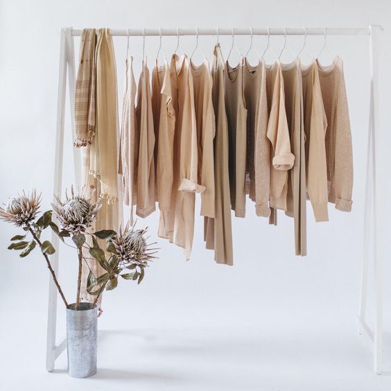
Look 2: "This image features a cosmetic range of colors and demonstrates how one can mix a natural colored cashmere sweater with our colors Alabaster and/or Dune".
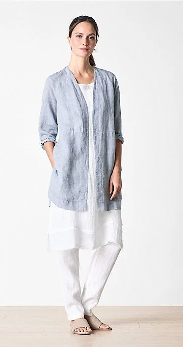
FROM LEFT —
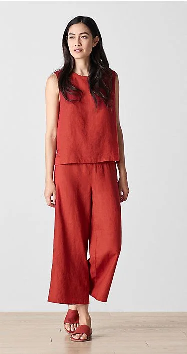
Look 3: "This is a monochromatic look, which is an important trend right now. The color Serrano is intended to punctuate a pinky-light red color story, in a particular delivery for Spring 2018. It’s a refreshing and crisp look. This outfit in Serrano creates a 'searing' effect in the heat in the midst of summer".
Look 4: "We love white in summer, and here it's paired with chambray, which is created by cross dying two colors―white and a darker blue, which then creates a faded look in the fabric. This is then combined with a white look again, giving it a fresh, summery appearance".
Look 5: "Papyrus dress--although this is a 'color', it can have a neutral appearance. It can mix with another neutral type color, such as Dune or Natural and then can create gorgeous subtlety to an outfit".
Learn more about Chris and her work at chriscostan.com.