Houghton Chemical's Pastel Tanks — A Lesson in Color Perception


Here’s a lesson in color perception found in my own neighborhood. I recently photographed these pastel tanks in Allston, Massachusetts. I pass them regularly while on the Mass Pike, and I’m consistently surprised by them. They’re so incongruous with the landscape of Boston, which, in my mind, is primarily brown, brick red & Celtics green.

I googled “pastel pillars Allston” and found this article from The Boston Globe. The tanks belong to Houghton Chemical. The color palette was selected by the company’s staff in the 1960s and has stayed the same ever since.

In 2005 the owner said, “There is an expectation in people’s minds that industry is ugly. Therefore we wanted it to be an artwork ... There’s no reason other than to spread beauty and joy”.

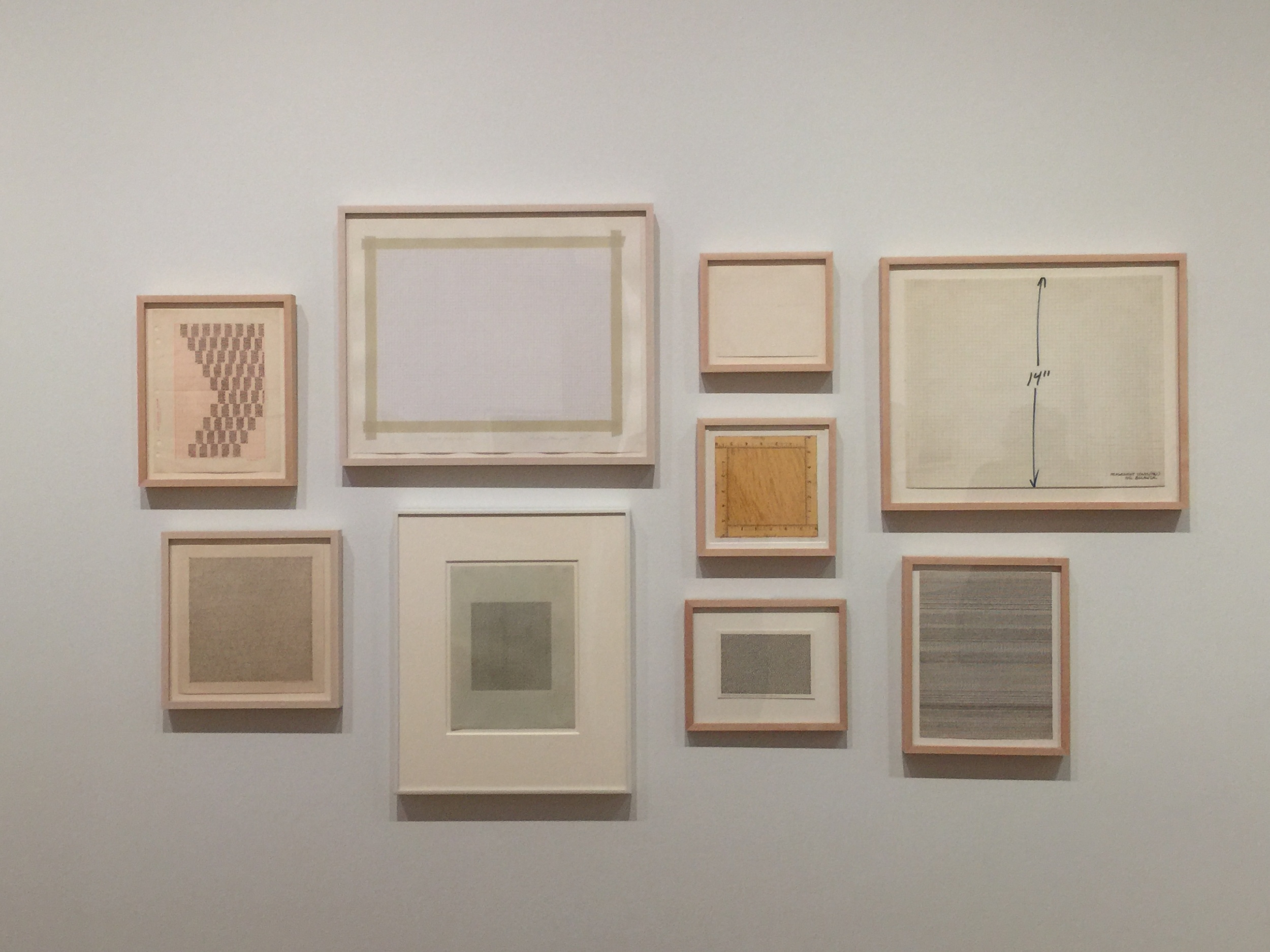
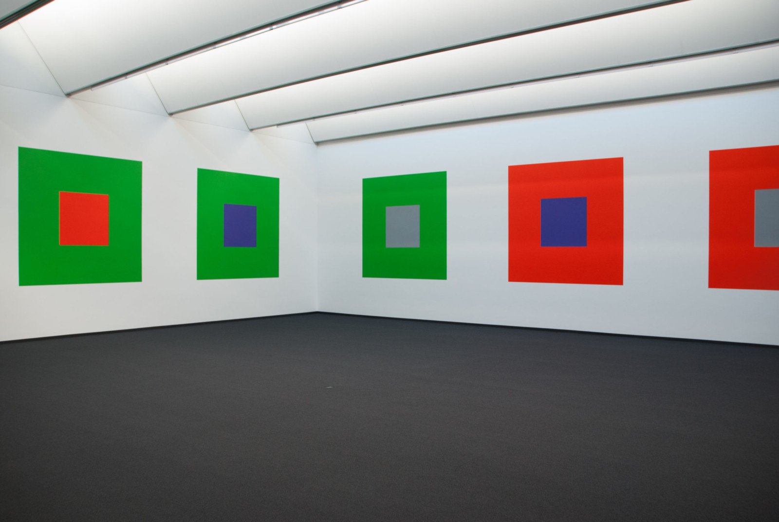
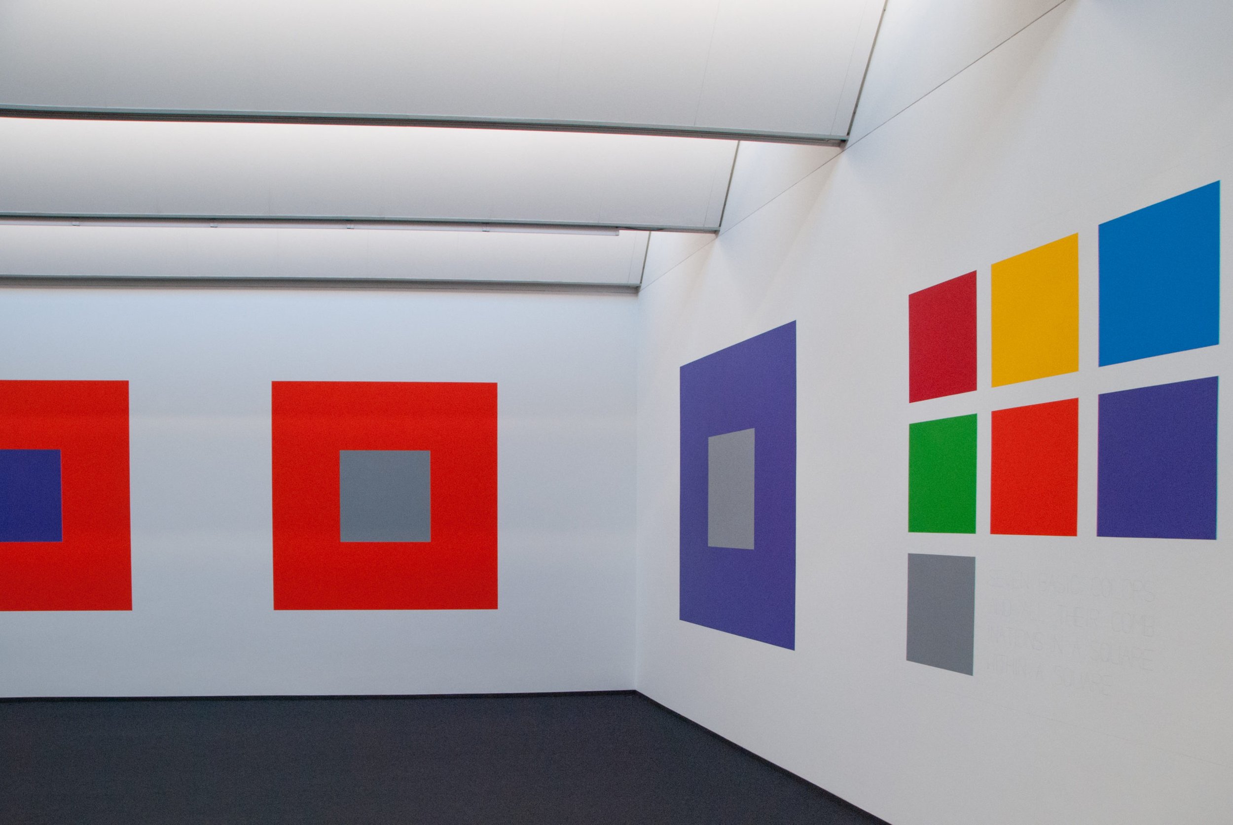
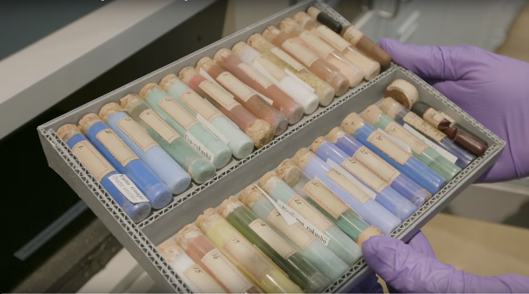
Photos by Sophia Naureen Ahmad


Inside Indigo — After Workshop at NYC's Textile Arts Center


Textile Arts Center Indigo Dyeing After Workshop NYC

My indigo samples.

My blog turned 1 this month!  My first post went up in October 2015.  To mark the occasion, I treated myself to a workshop on indigo dyeing at Manhattan's Textile Arts Center. I had no prior experience with dyeing in any form, so I really enjoyed this process.

Ingredients Used in the Indigo Dye Recipe

  • one part organic indigo powder

  • two parts fructose crystals

  • three parts pickling lime

To make indigo soluble in water, it requires antioxidation and alkalinity. The fructose removes the oxygen, and the pickling lime serves as the alkaline agent.

This is known as Michel Garcia's 1-2-3 method. You can learn more about it here

Dye ingredients.

A peek into the dye vat.

We were each given strips of silk and cotton muslin (both bleached and unbleached). Once the dye was ready, we dipped each strip in water, then into the dye vat. Inside the vat, we gently rubbed the fabric, which helps it absorb the dye.

We observed the effect of the dye on each fabric strip, as well as the impact of each dip.

Then we waited for a while for our fabric strips to dry.

Textile Arts Center Indigo Dyeing After Workshop NYC

Indigo appears lighter after drying. Below are my swatches, a mix of cotton and silk. I took this photo at home after fully drying and ironing them.

The lighter ones were dipped once or twice. The darker ones I dipped up to five or six times. 

Textile Arts Center Indigo Dyeing After Workshop NYC

After trying solid dyeing, we moved to shibori, an ancient Japanese dyeing technique.

Here are a few shibori samples our instructor shared with us. Each sample notes the type of dye used and the number of dips. These are much more precise than the notes I took in class. I think for any dye project, having this info on hand would be super helpful.

In shibori, various blocks, plates and clamps are used to manipulate the fabric and create patterns. The indigo leaves a bluish patina on all the dyeing tools, which is so pretty to me.

Textile Arts Center Indigo Dyeing After Workshop NYC

Drying our shibori samples.

Textile Arts Center Indigo Dyeing After Workshop NYC

Here are my shibori samples, both silk. For the left piece, I placed a few marbles and buttons on to the fabric, tying each one tightly with a rubber band.

On the right, I first folded the silk a few times into a rectangle. Then I sandwiched it between two plastic square discs and secured everything with two metal clamps. 

I didn't overthink my shibori techniques— I was more curious to see what would happen. Even with amateur execution, shibori yields beautiful results.

Textile Arts Center Indigo Dyeing After Workshop NYC

Thanks to Textile Arts Center and our instructor, Clare Frost, who really knows her stuff. TAC offers classes that honor handmade techniques, like weaving, block printing and fabric marbling. 

Go here to learn more — textileartscenter.com


JOSEF ALBERS — Perception Through Iteration, Color Workshop


In visual perception a color is almost never seen as it really is—as it physically is. This fact makes color the most relative medium in art. In order to use color effectively it is necessary to recognize that color deceives continually.
— Josef Albers

I recently attended a workshop based on the teachings of color master Josef Albers.

The workshop, titled Perception Through Iteration, was led by Fritz Horstman, the Artist Residency and Education Coordinator at the Josef & Anni Albers Foundation. At Manhattan's Drawing Center,  Fritz took us through a few exercises from Albers' groundbreaking book Interaction of Color.

Various editions of Albers's book, which was published in many languages. See more here


I was introduced to Albers' work years ago, in a color theory class at Parsons. In the work I do now, arranging color and creating palettes is less a formal practice and more a result of instinct and mood. I felt I needed a refresher. As Fritz explained, for Albers,  "color was material". This idea resonates with me, as I've come to realize that nearly every photograph, collage or moodboard I make is driven by color. Color is my preferred language and medium.

For each exercise, the students shared a box of Color-aid, matte sheets of paper that come in brilliant standardized colors. This is the same paper Albers taught with, and it's become a standard teaching tool in art and design classes. I still have my box from that color theory class.

Josef Albers Color Workshop Color-aid Paper

The colors are so rich and such a delight to work with. In the presence of Color-aid, you'll hear a lot of gasping, oohs and aahs, and things like, "It's too pretty to cut!'.

Josef Albers Color Workshop Color-aid Paper

Exercise #1: Make Three Colors Appear as Four

Set two colors side by side. We'll call these the host colors. Then place a third color on top. This will be the sample color. With a thin strip of white paper, separate the sample color into two distinct colors.

It took a few tries to get it right —

Josef Albers Color Workshop Exercises Color-Aid

According to Fritz, if the sample color shares qualities with one of its host colors, you are more likely to see a visible shift. Another hint: the smaller the sample color is, the more light it will absorb from its host color.

I settled on the three cool colors below. On the left, the sample color looks green. On the right, it shifts subtly to a cooler blue.

Josef Albers Color Workshop Exercises Color-Aid

Exercise #2: Make Three Colors Appear as Two

Set two host colors side by side. Then place a third color on top. The goal is to make the sample color on each side resemble the opposing host color. 

After many tries, it became evident that the the more similarities all three colors shared, the easier it would be to pull off.  How did I do?

Josef Albers Color Workshop Exercises Color-Aid

Exercise #3: Make Four Compositions with Four Colors

In the last exercise, we were asked to pick four colors at random and trade them with a partner. Then, create four distinct compositions, using similar shapes for each one. The idea was to explore the relationships between colors that don't necessarily share similarities in hue, value, or saturation. Or, to work with colors we're not naturally drawn to. For me, that would be the slime green you see below.

Josef Albers Color Workshop Exercises Color-Aid

After seeing my fellow students' work, I realized my choice of rectangular strips was pretty conservative. With a quick, simple exercise, you can see some interesting ideas taking shape here. 

Josef Albers Color Workshop Exercises Color-Aid

The backdrop of this workshop was The Drawing Center's gallery space, currently housing Drawing Dialogues: Selections from the Sol LeWitt Collection. The collection features pieces by artists like Eva Hesse and Dan Flavin. I love the feeling of the space.

Drawing Center New York Sol Lewitt Drawing Dialouges

Sol LeWitt never studied under Albers, but was influenced by his work. In 2005, LeWitt's work titled Seven Basic Colors And All Their Combinations In A Square Within A Square was unveiled at the Josef Albers Museum in Bottrop, Germany. The wall mural, commissioned by the museum, was LeWitt's homage to Albers (see images below).

Thanks to The Drawing Center for having me!


Inside the Color Vault: Forbes Pigment Collection


The color vault at Harvard's Straus Center, known as the Forbes Pigment Collection, is home to some of the world's rarest pigments. This video, presented by Great Big Storyfeatures a tour by Straus Director Narayan Khandekar. He shares bits of fascinating history behind pigments with names like Dragon's Blood, Mummy, and Indian Yellow.

Forbes Pigment Collection

Watch the video: