

Color is a small world. With social media, it’s become even smaller. I met Jenn Costantino in a professional context years ago, but it wasn’t until later, when we followed each other on Instagram, that I noticed a rare quality for colorists in the fashion industry. Jenn appeared to have a true passion for color, something that went beyond her job. Her point of view struck me as optimistic, vibrant and happy (also rare in the fashion industry!).
At Banana Republic, Jenn is known as the “Color Guru”. She has managed the brand’s color process for over five years. I wanted to talk to her about what a fashion colorist actually does, since it remains mysterious for many people. I’ve worked in this area of fashion myself, and I still struggle to explain it sometimes. Note: it has nothing to do with colored pencils.
Before moving to Milan earlier this year, I visited her in the color room at Banana Republic’s design office. We talked about her personal connection with color, as well as some essential aspects of her job, like using the right color language, building a solid palette and picking the perfect color name.
“It was probably the biggest compliment I got at Parsons. I was told, “You have a really good eye for color that takes years to develop, and you need to use it”.
“Colorist” is a job title in a few different industries. It usually makes people think of film or painting or hair color. What does it mean at Banana Republic?
Being the Design Manager of Color for Banana Republic means that I get to work with the design team and brand leaders on creating a beautiful vision that the customer is going to hopefully love, buy and create amazing memories with.
I'm not the fashion industry's typical colorist. I deal a lot more with concept. I’m very lucky to be able to have so much creativity in my job where I get to research trends and have a say in where I feel the brand needs to go trend-wise. I'm creating a road map or a blueprint of color for designers to follow. For womenswear, we have nine color palettes a season, so the designers need to know the specific direction for each part of the store.
Banana Republic has established itself as a classic American brand for decades now. How would you describe the color aesthetic of the brand?
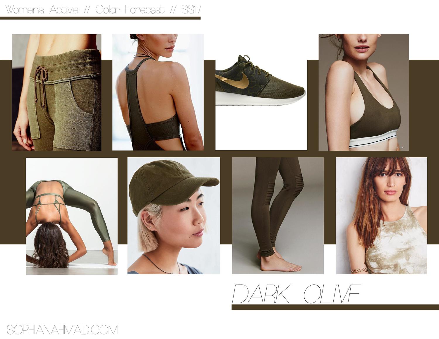
The one color I would always associate with Banana Republic is olive because that is the heritage and culture of our brand. We will never not have a great olive in our store. It’s also important to keep the store looking elevated with other neutrals and positive pop colors.

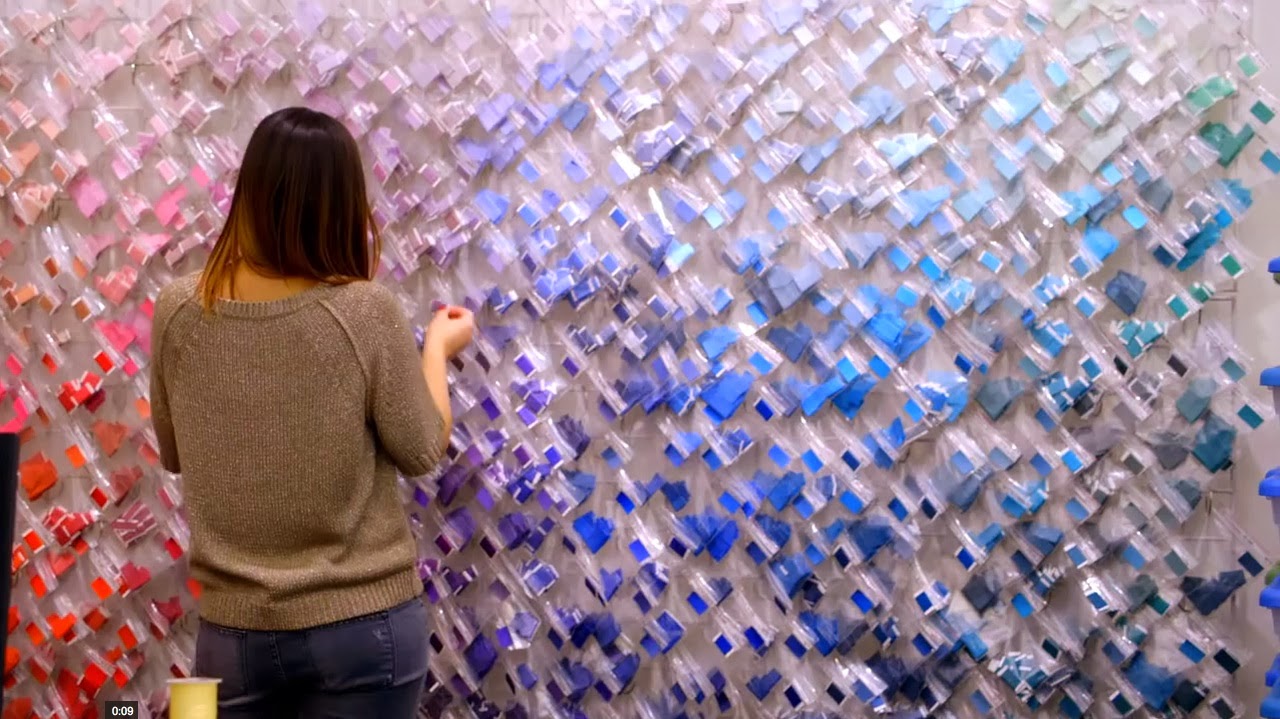
The “color wall” is a point of reference for recently trending colors.
What is the color selection process like?
Color is the beginning step for the design process every season. It starts with color. Each season, I work with two VPs on the color palettes. They put up tear sheets, they tell me what they like. Right now I'm doing trend research for Men's. I'm putting together images of what I feel are the important colors for the season. I’ll show that to the VP, she'll think of the concept, and whatever her concept is, I'll start the color palette based on that. It's a month long process. The designers get involved. I'm steering the color ship, but the design team and I work together to make sure we have the best colors in the store to represent their product.


Jenn’s color palette exploration.
How does your job fulfill you creatively?
Creating color palettes for both the Men’s and Women’s design teams really lets me play with different colors. I get to work with such a creative team of designers. I’ve been here for 5 years and have yet to be bored. You have to be able to work with a lot of people in my job, especially because color is so emotional. Working with designers, they're emotional about what they do. You want to make sure the VP's vision is executed in the right way. Color plays a huge role in that.
Why is color an important skill for designers to have?
Color is very emotional, and it’s the first thing the customer sees. You want the color to entice the customer to the point that they want to keep on coming back to the store because we know exactly what they want.
What’s your philosophy for creating the perfect palette?
Neutrals first! Is your palette based in navys, greys or olives? Maybe it’s just a few different levels of creams. You need to create a strong base for the pop colors, then you slowly build in levels and add accent colors.


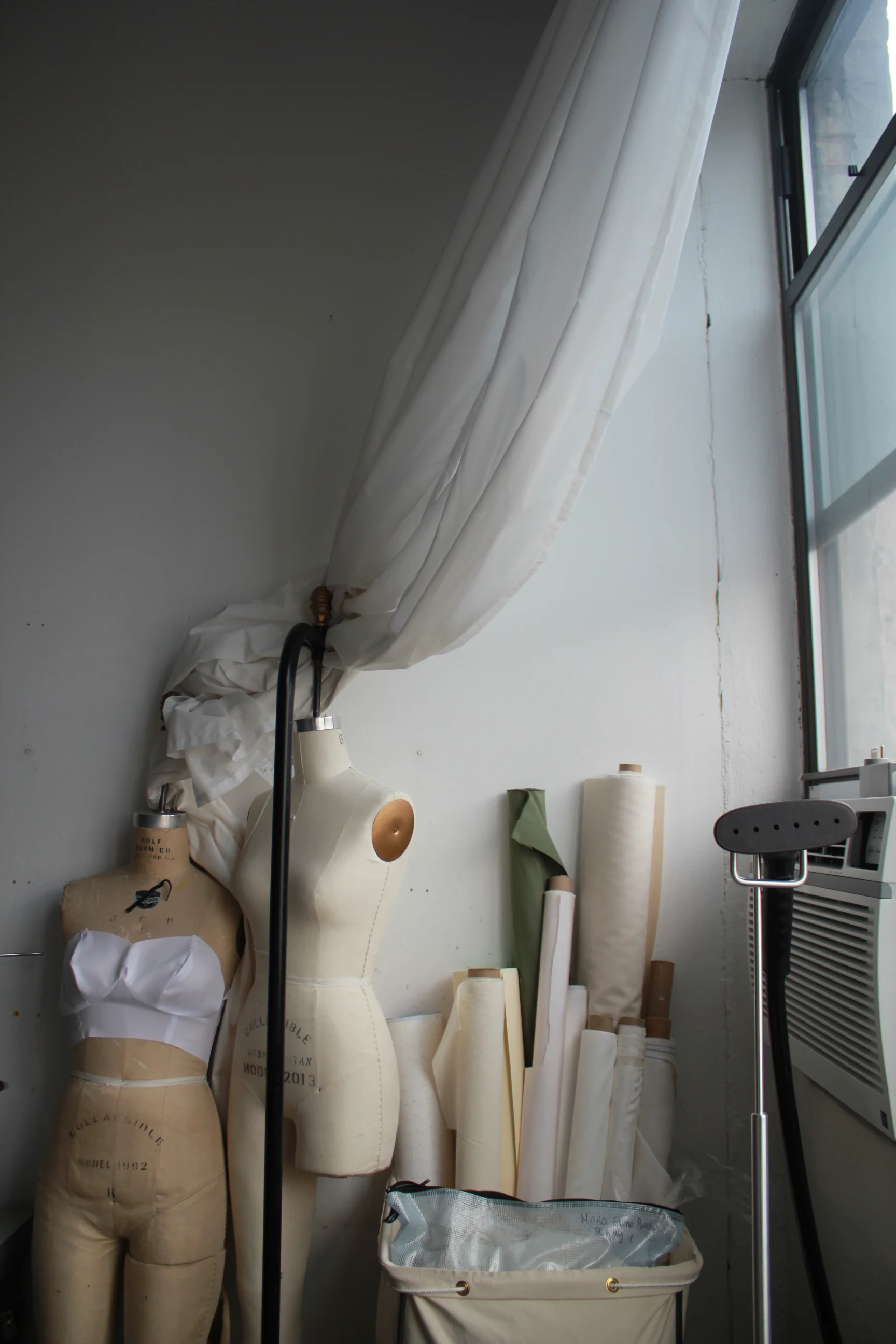
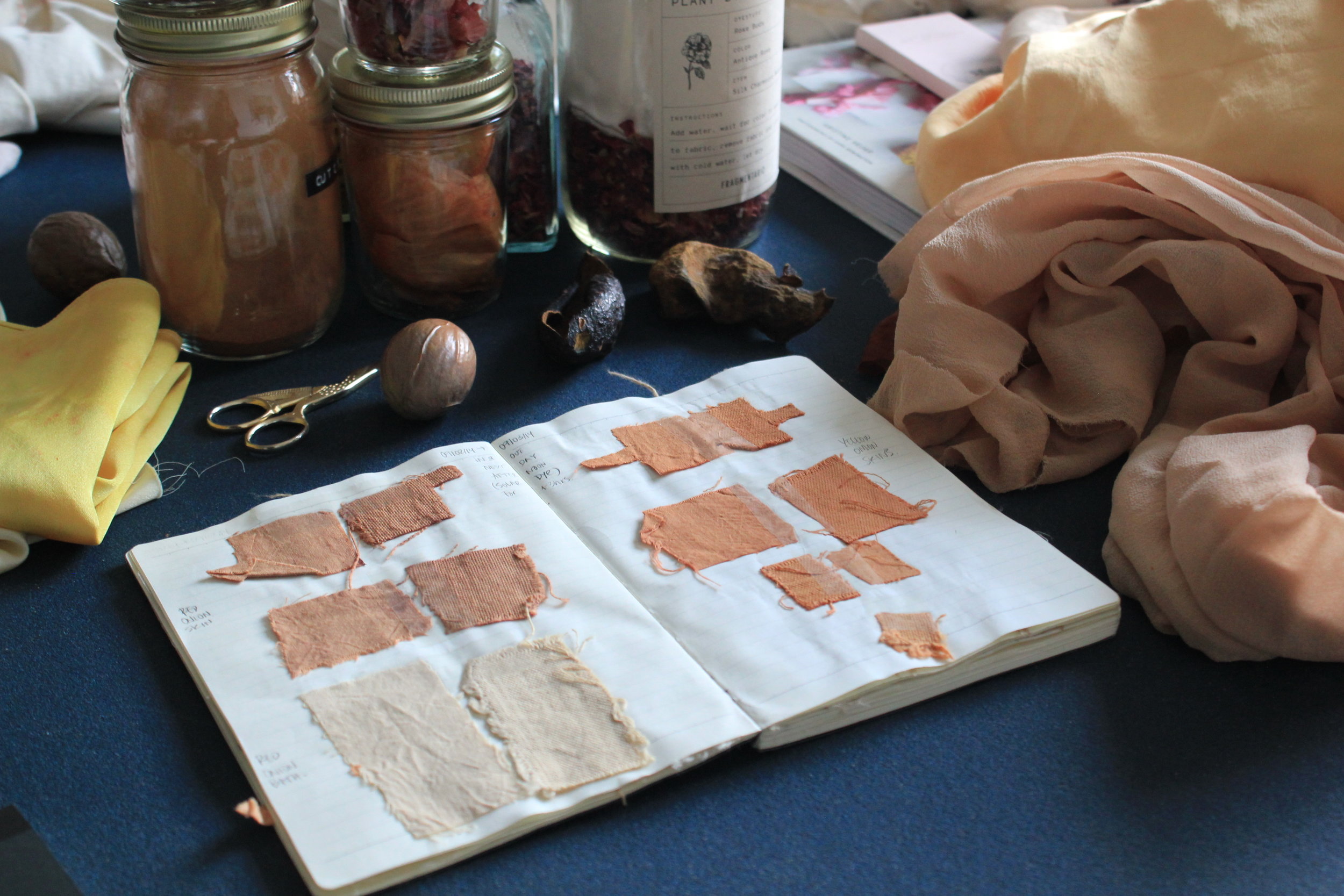
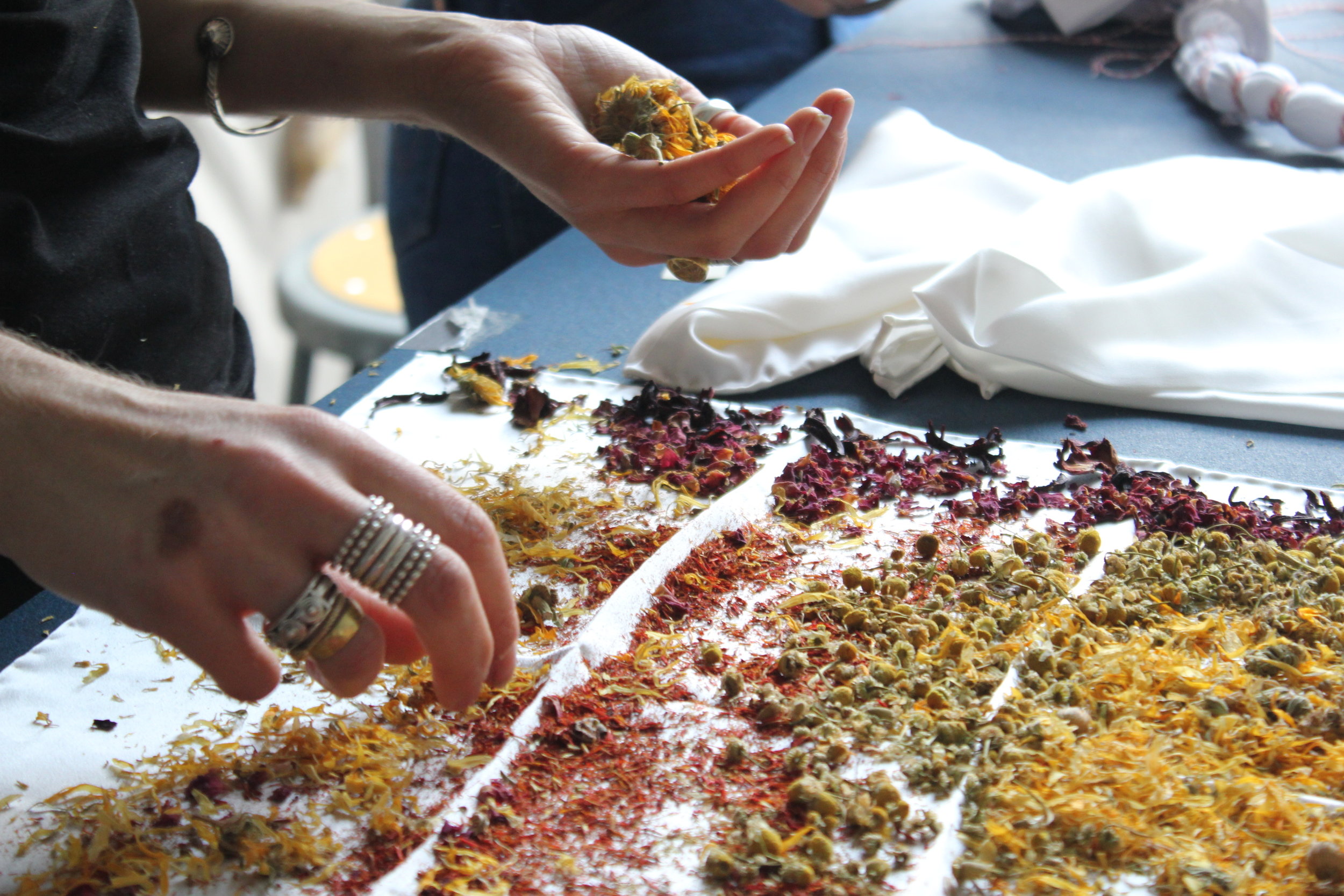
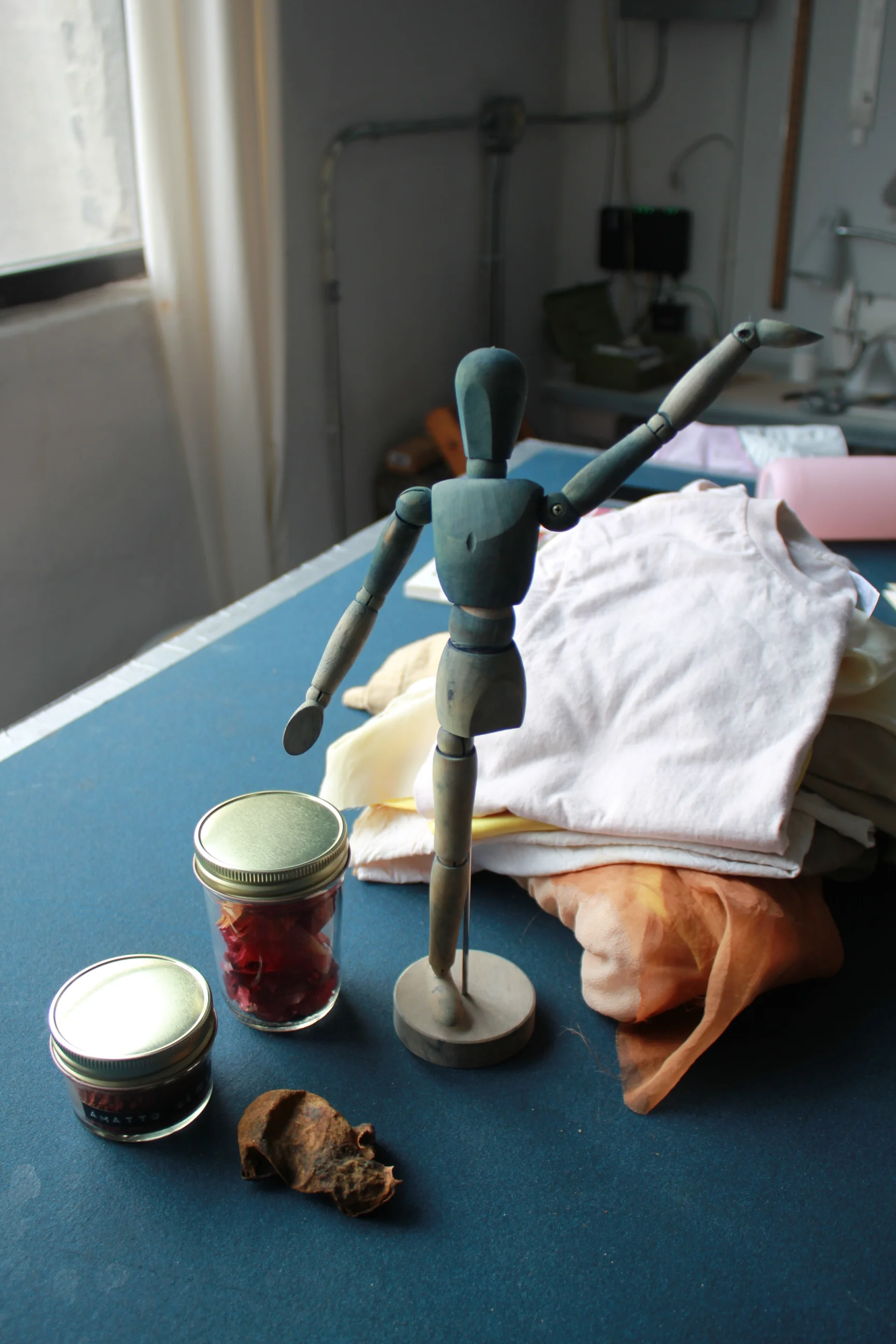
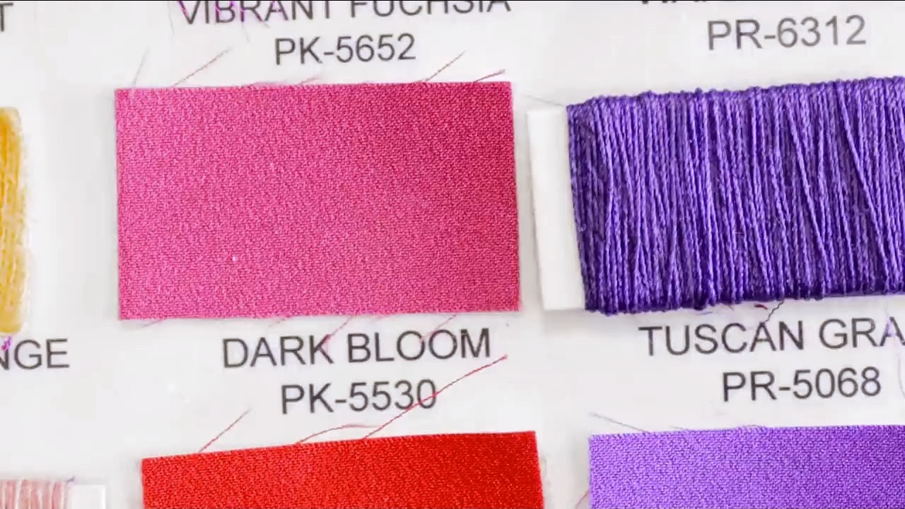
Fabrics, yarns, threads, swatches - color reference tools come in many forms.
What are some of the more specialized skills required in your job?
Once the palettes are done, if we're using clothing samples, it’s part of my job to go to the color library and match them to our standards. If it's not in our standards, I get it developed through a color service provider.
I evaluate color. A designer just came in because this white denim was coming out too yellow. She needed to know what to tell the mill, how to use the right color language. Designers come to me and say "We need a red that’s darker than this swatch", and I’ll explain that what they really want is a red that’s bluer, because that’s what the mill is going to add to make it darker. Having that technical knowledge is important because it helps you back up your creative vision.

Jenn shows Banana Republic’s Spring 2018 palette in a light box, a machine used to evaluate how color appears in various forms of light.

Jenn evaluates a green swatch with a spectrophotometer, a machine that measures color in fabric, more specifically the amount of light intensity in each part of the color spectrum. This is how colorists determine if a fabric has the right amount of red, green, yellow, or blue and what adjustments need to be made for the color to be production-ready.
Why are standardized colors used in fashion?
At a big company like Banana Republic, we have several mills that are producing the sweaters and the knits and the pants, etcetera. Everything has to fit in the store together. All the clothes are being dyed in different fabrics, and they're all being dyed by different people in different places. They need the color standard to measure against.

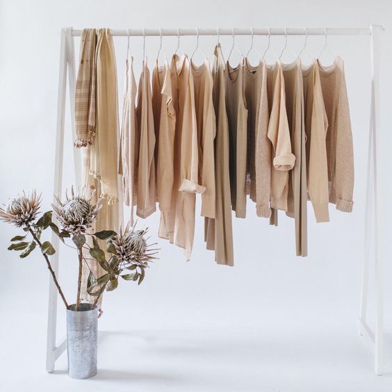
One of many greens found in Banana Republic’s color library. As tastes and trends evolve, fashion brands keep references of all colors, including those that are tried-and-true and ones that could be used in the future.
Why is it useful for Banana Republic to have a library of its own colors?
We're such a large company and we've been around for so long. Usually the bigger companies have color libraries. New colors go into the library every season, it keeps growing and growing. It's an amazing thing to have because every season, we can go back to them. It's like having a Pantone book on a really big scale. If we need a specific blue, we have over a hundred blues to choose from.
And each of those blues has its own unique name. Why is that important?
Imagine you have one little piece of fabric, and it's not labeled and it goes from here to a mill in India, and all the merchants have to reference that same color. It would be impossible without a name.
My recipe for naming a color is that you should be able to close your eyes and picture the color, like Rockaway Grey or Egg Yolk Yellow. You want the name to be as descriptive as possible. And it has to be an exciting name because eventually, it could be featured on the website. It could go all the way to the product level. You don't want to call a sweater Dirt Brown. Cappuccino would be a more elevated, sophisticated name for that brown.
Do you find that color names can also affect a creative team’s decision making?
Yes! Designers come in to the color library and they'll see a color like "Tickle Me Pink", and say “Oh, that's cute!” So it can affect the way the color is perceived.


Jenn quoted in Banana Republic’s email promotions for Summer 2018.
So, when did you first realize you had a strong eye for color?
It was a teacher at Parsons that pointed it out. I studied fashion design there. I had a critique, all the students had their illustrations out. I was bad at draping, I was bad at patternmaking. Those were not my strong suits. I went to Parsons because I love to draw and paint. My drawings were good. It was probably the biggest compliment I got at Parsons. I was told, “You have a really good eye for color that takes years to develop, and you need to use it”.
Office moodboard.
You’re a native New Yorker, but your taste in color is very California - sunwashed oranges and yellows, ocean blues. Your Instagram feed is filled with palm trees and surfboards. Where does that love of California come from?
My mother introduced me to the music of the Beach Boys at a very early age. I also started watching surf movies like Endless Summer and some Elvis Presley beach flicks. From then on, I was always drawn to surf culture and the beach. Palm trees, surfing, and the colors that are associated with beach life, I equate with peace and happiness. It was where I always escaped to in my dreams growing up. I try to surround myself with as much beach culture as possible since it brings me so much joy.


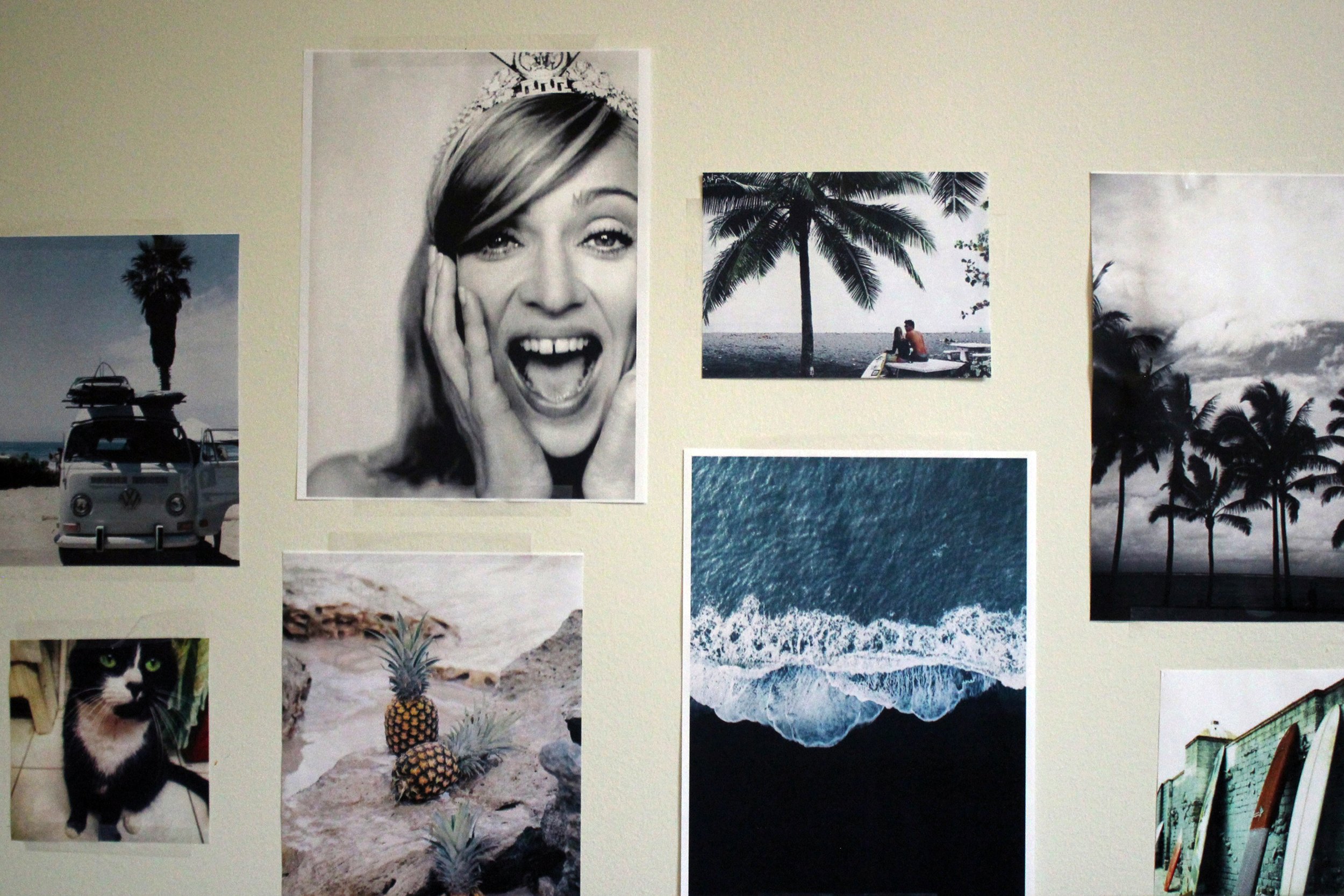
Posts from Jenn’s Instagram feed. Follow her @jennsmusic.
Could you describe a time when you had a strong emotional reaction to color?
I think it honestly was when I traveled to the Caribbean for the first time when I was in college. I didn’t know water that blue and bright existed anywhere! It filled my soul with so much peace. How can anyone be unhappy looking at that?
How did that moment influence your taste and approach to color now?
I don’t ever want to put dull or drab colors in a palette. You want something that makes you feel beautiful and happy when you look at it. At Banana, we want to make our customers, both men and women, feel beautiful and confident. You always want to evoke a positive feeling with color in retail.

“Color is very emotional, and it’s the first thing the customer sees … You always want to evoke a positive feeling with color in retail”.

You’re also a singer/songwriter. Have you ever experienced synesthesia? Is there any connection between your love of color and music?
I have written songs about color, but I don’t see color when I sing or hear music. I can imagine it, but I keep both senses very separate. When I sing I focus very much on the sounds and creating a beautiful melody, and it’s very personal. When I create color palettes, I of course use what feels good to me, but because I work for a brand with such a strong customer, I focus more on what’s going to make the customer feel great.
Lastly, where else do in your life do your color skills come into play?
I never stop being inspired by colors I see. I see color palettes or make note of new exciting colors I see in everyday life, as I’m sure you do as well! My job also comes in handy when friends or family need help choosing paint colors for their house!
P.S. Check out Jenn’s favorite Instagram accounts for color inspiration:
@kimkeever.art, @_jujujust_, @neohumanity, @voguerunway, @chromayoga