
My introduction to Publicolor happened in high school. I read about it one of my favorite magazines at the time, YM.
The ethos of the organization resonated with me — liven up drab, underserved schools with color, and consequently, boost the students' mood, attendance, and test scores. A simple idea, yet deeply affecting. It sounded like a win-win. I remember talking to my friends about it in the cafeteria, wishing there were a program like it in our city.
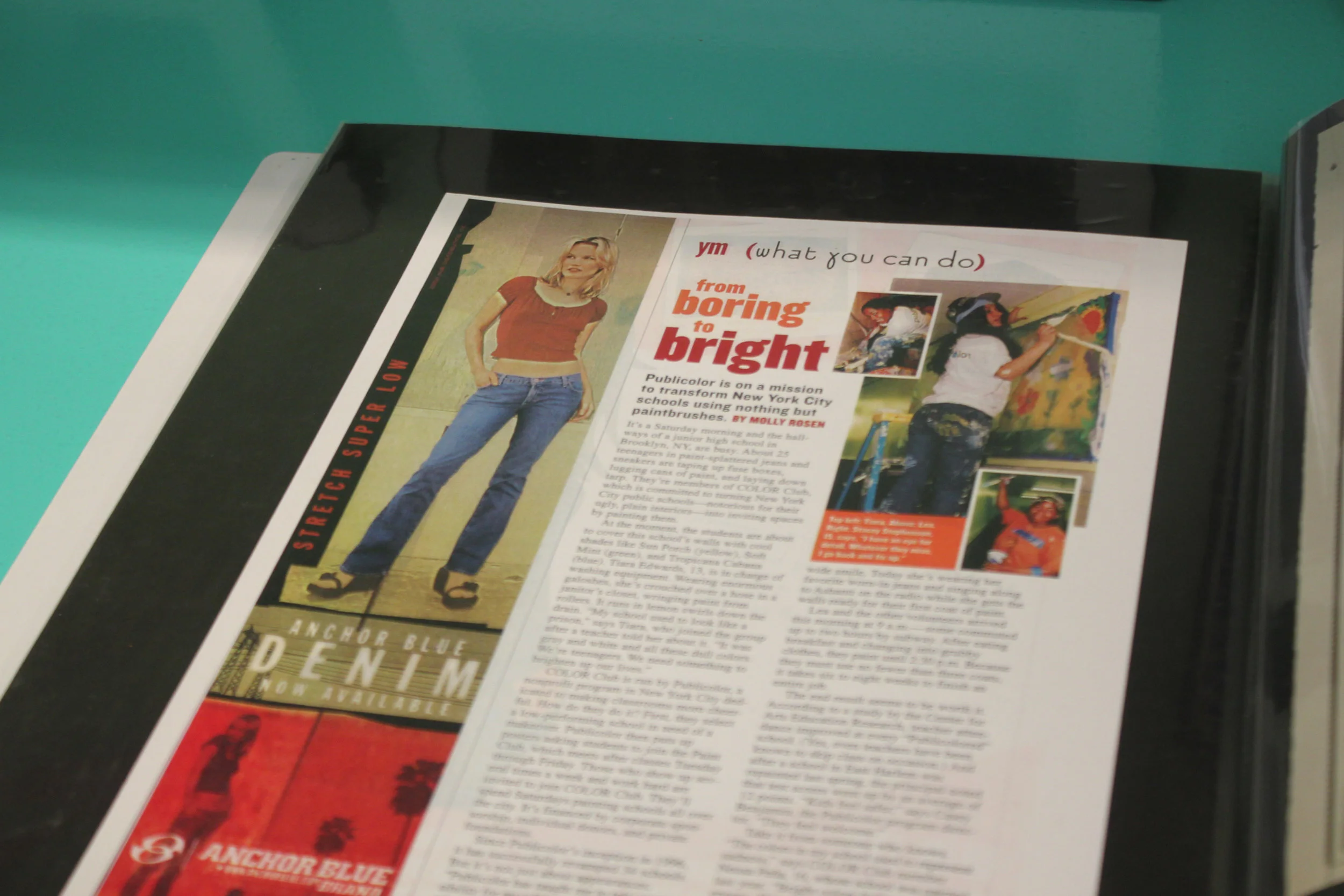
"From Boring to Bright" in YM magazine. My introduction to Publicolor, spotted in a book of press clippings.
I've lived in NYC for over six years now, so I'm not sure why it took me so long to get involved (seems like a no-brainer). But I'm so glad I did.
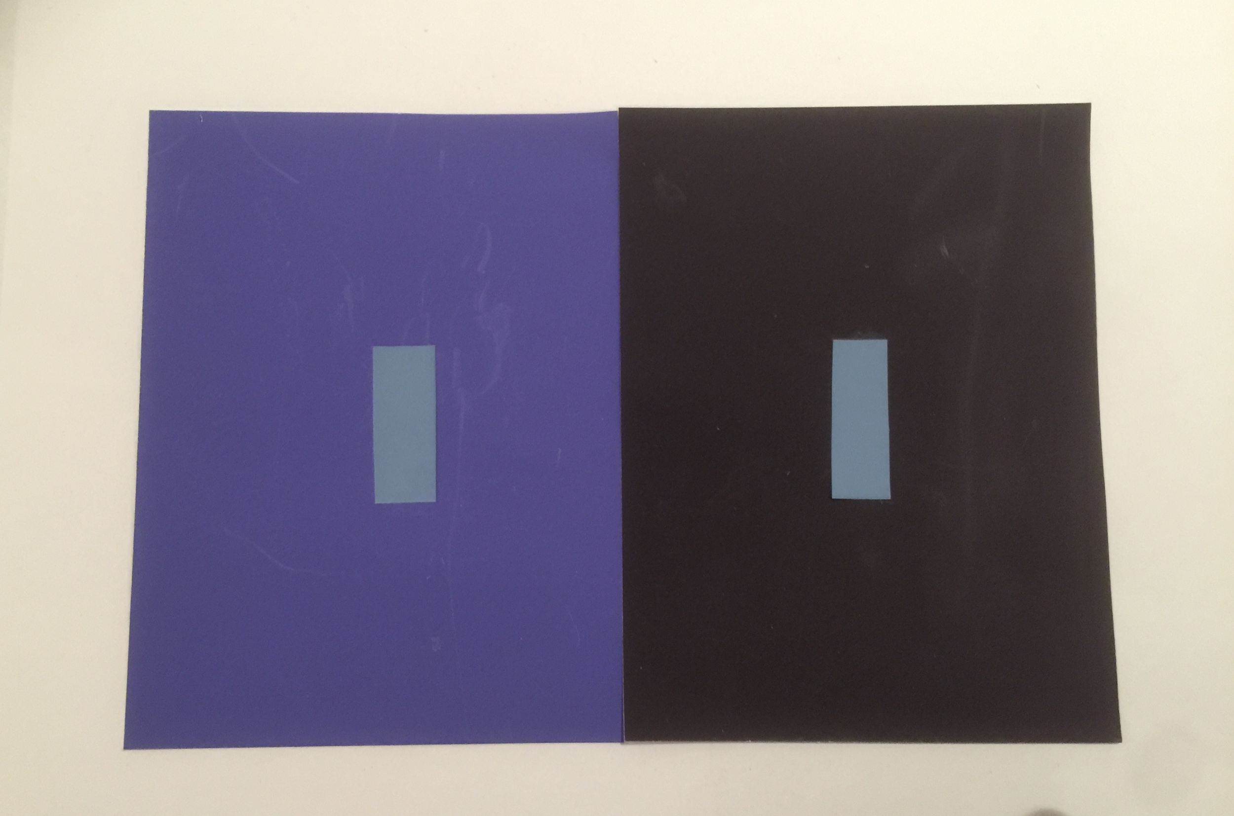
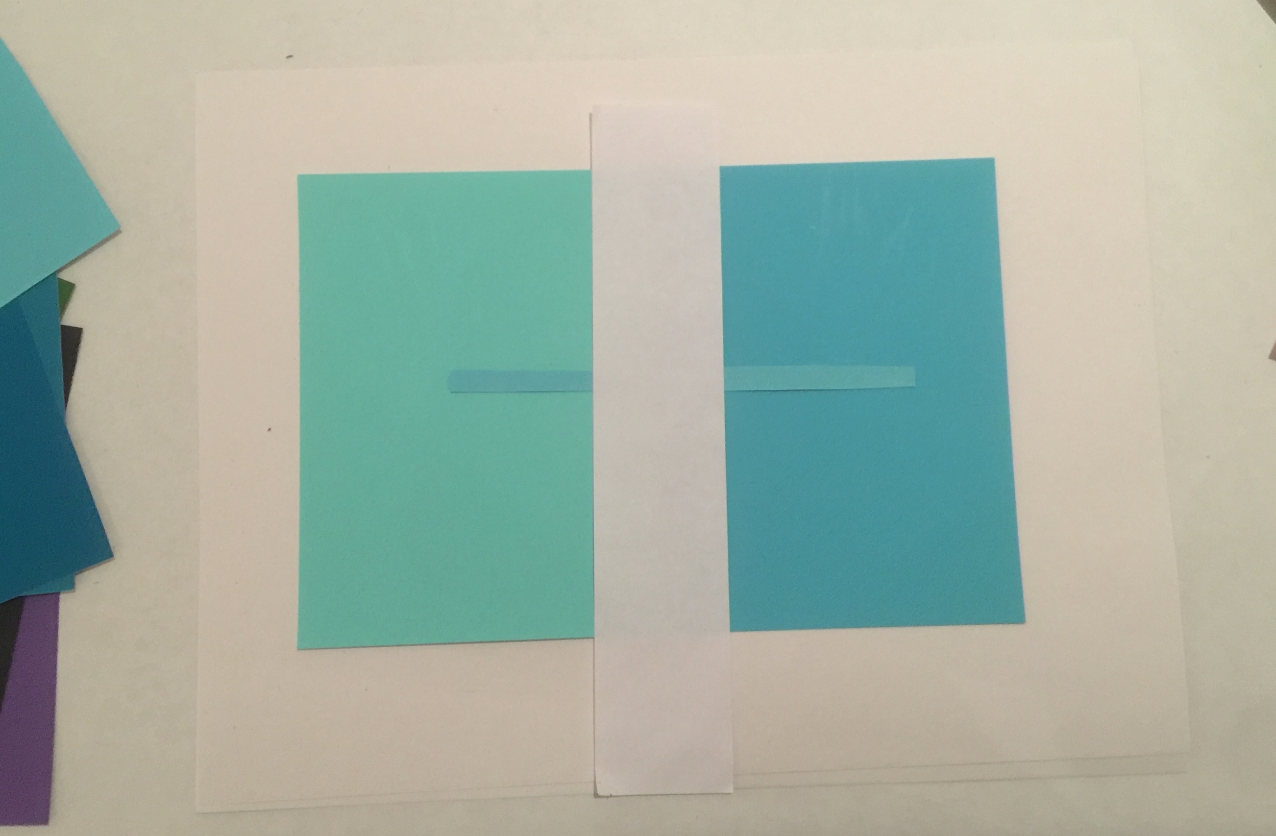
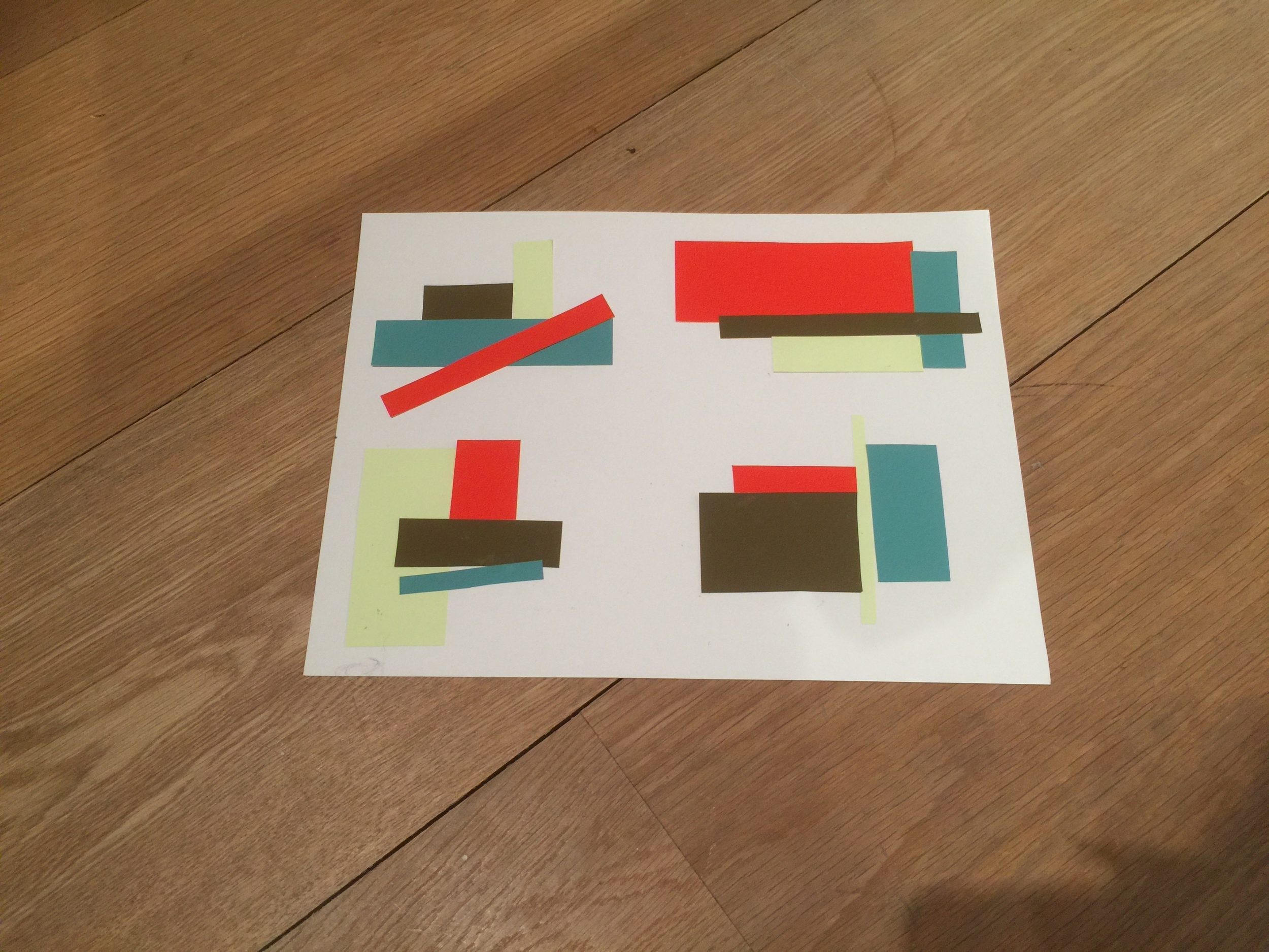
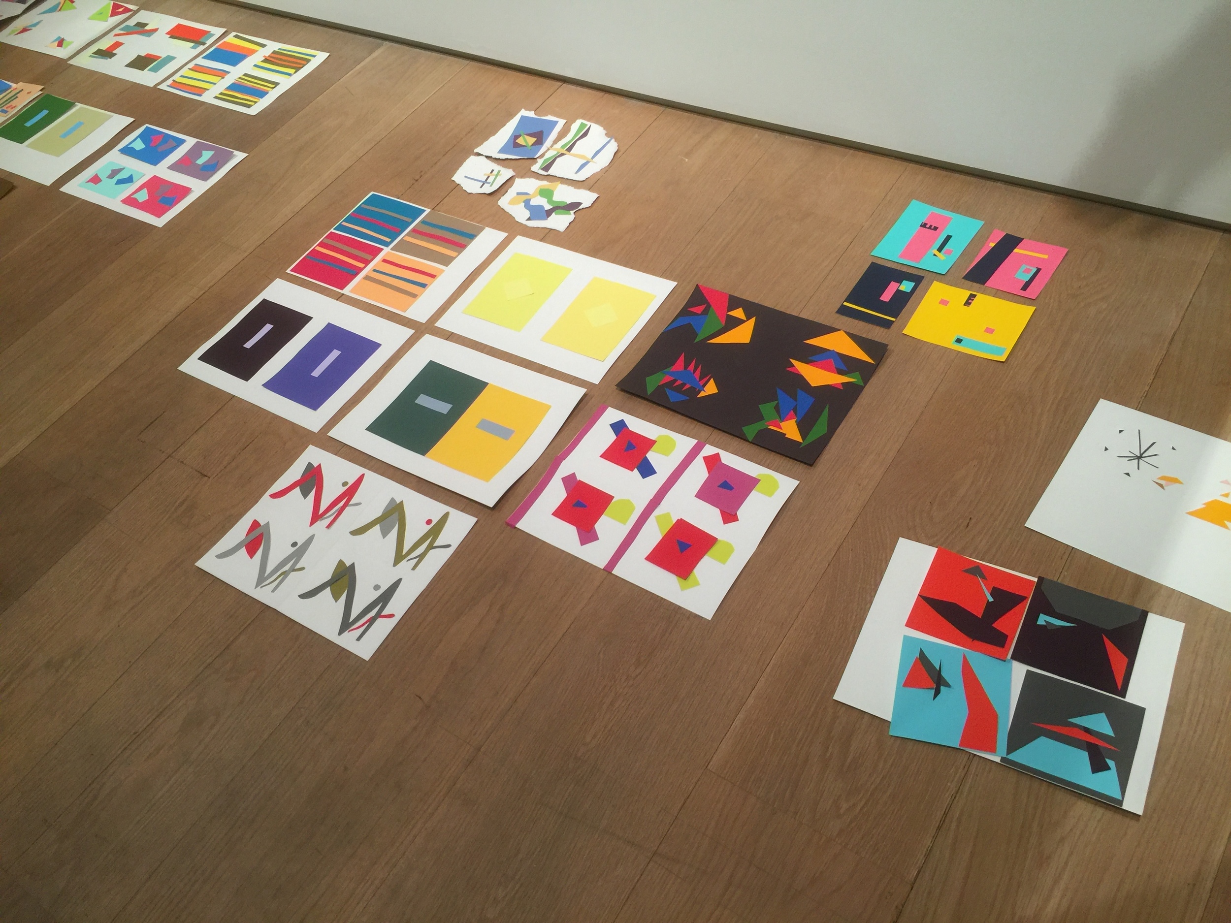
After volunteering at a painting day this past October, I was invited to the Fall Crit, a showcase of design projects created by students in Summer Design Studio. It’s one of Publicolor's many youth development programs.
Stepping into the midtown office, I felt as if I'd been transported into another world. It felt alive. I instantly knew I wanted to photograph the space.
I'm excited to share these photos, along with the first-ever interview on my blog, a Q&A with Ruth Lande Shuman, the founder and visionary behind Publicolor.
To get involved, visit publicolor.org.
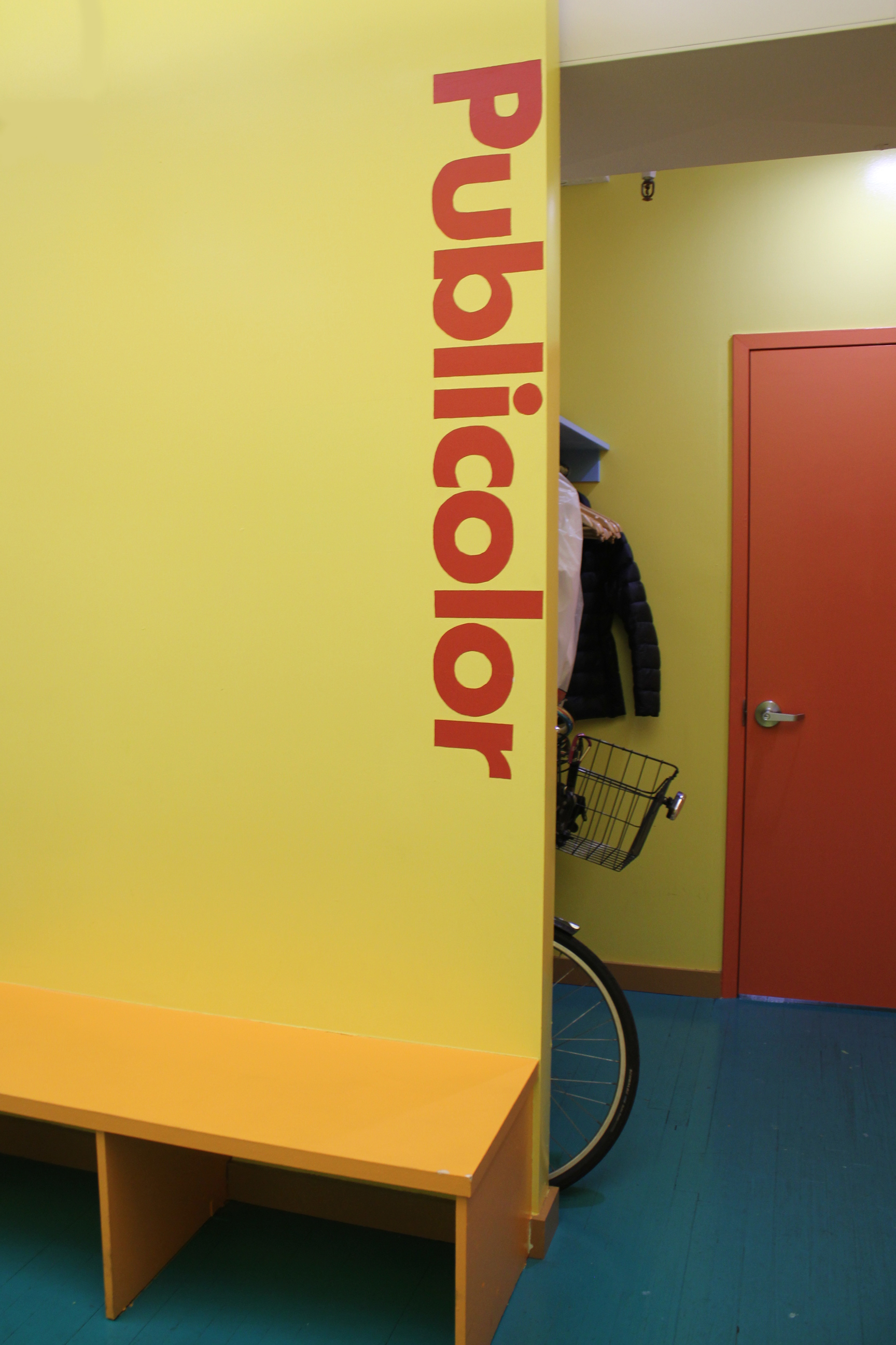
Welcomed with the Publicolor logo, a design by the iconic Massimo Vignelli.


"Color Design for Roosevelt High"


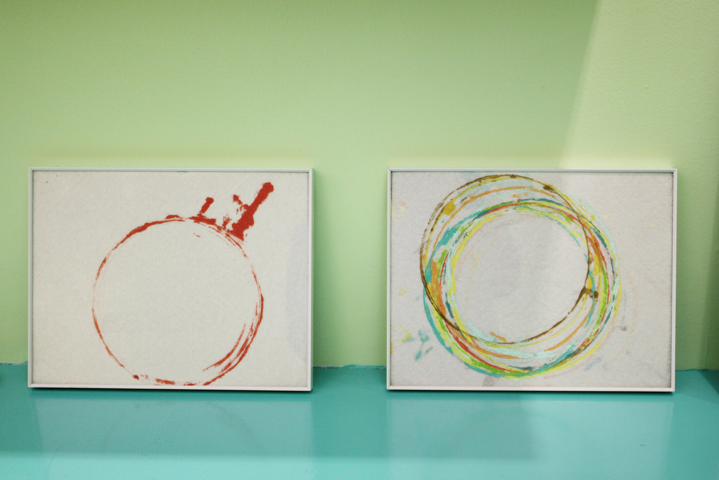

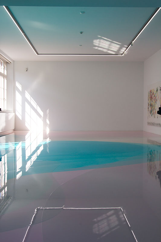
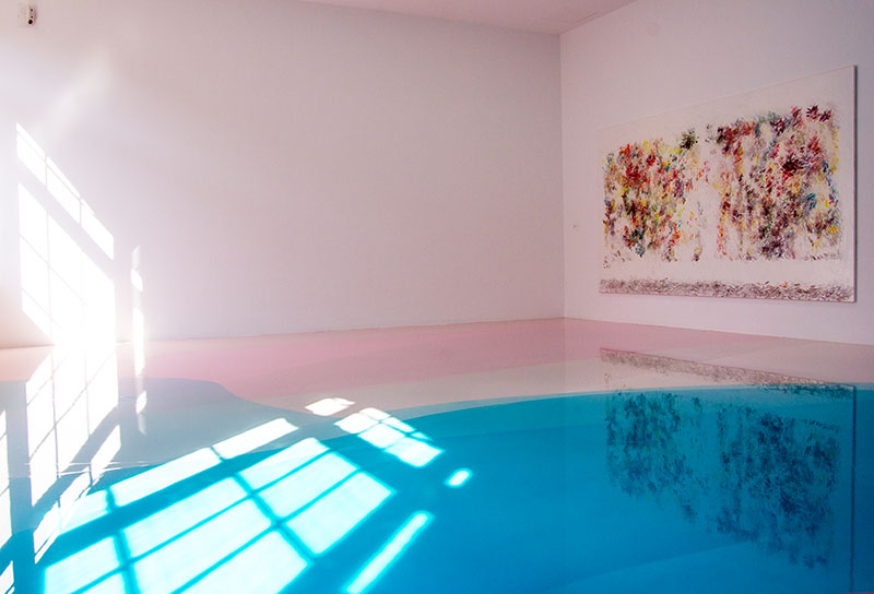
A piece by artist Gaetano Pesce, friend and collaborator of Ruth Lande Shuman.


Q&A with Ruth Lande Shuman, Founder of Publicolor

Photo c/o New York Social Diary. Click the photo to read a fantastic interview with Ruth from 2012, which features many beautiful photos of her home.
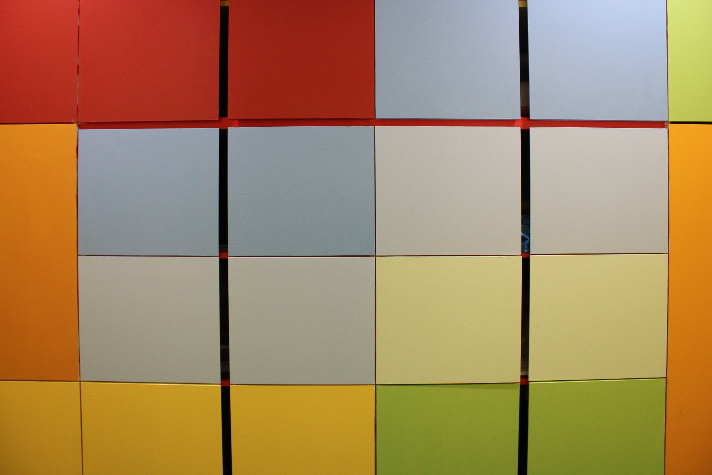
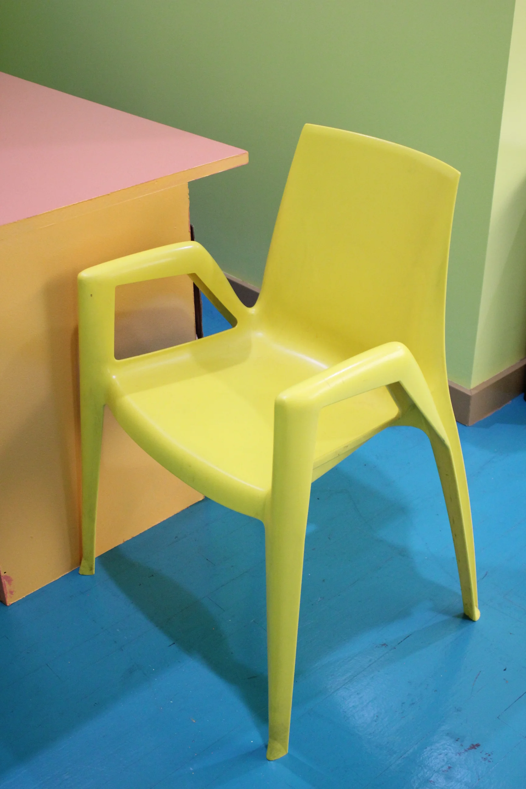
The color palette of the office is your design. Everything is rich with color, even the staplers and coffee mugs. What mood or feeling did you want to convey for yourself and your staff?
Happiness + Energy.
I love the wooden color palettes you created for some of the older building designs. How do you go about creating palettes for each school that you work with?
Usually I work with the students to create the palettes.
For me, color is a language, sometimes mysterious. What is one thing about color that you wish more people understood?
It would be wonderful if more people appreciated the power color has to affect our moods + behavior.
What was a personal highlight at Publicolor for you this year?
Knowing that 97% of our students graduated high school on time + 100% went on to college or a post-secondary accreditation program.
What works of art have inspired you recently?
A recent visit to Gaetano Pesce’s workshop was enormously invigorating – so much energy!
I had to ask. What's your favorite color of the moment?
Red has always been my favorite color. I never pay attention to the colors of the moment.