SNEAKER WEEK PDX — Career Advice from Women in Nike Footwear Design

This past weekend, I attended my first Sneaker Week PDX, an annual event here in Portland. The mission is to connect the city’s sneaker community with its sneaker industry.

Backstage at SneakerWeek.

I listened in on multiple panel discussions and scribbled everything down in my notebook. The conversation that stood out to me the most took place on Sunday, focused on women in design. This panel featured women from different facets of the Nike footwear design team.

Women of Nike!

As a color designer at Nike, there were many insights shared that I personally found valuable. Looking at my notes, I realized that I had gathered some solid advice, relevant to anyone working in a creative industry. I wish someone had shared these insights with me when I first started in design.

Here’s a selection of gems from the women of Nike footwear (edited for clarity).


Have multiple channels of creativity outside of work; it takes the pressure off. — Francesca Capone, Sustainable Product Design

Your career will get progressively more challenging as you grow, so never be afraid to ask for help. — Louisa Page, Footwear Design for Jordan

Lean into the genius of the people around you.
— Marie Crow, Design Innovation

Don't fixate on job titles; think more about the experiences you want to have. — Nereida Pedroza, Color Design for Jordan

Don't feel that you have to fit into a specific box to get the job you want. Play up your own strengths, rather than what you think others want to see. — Sophia Weston, Color Design for Women’s Classics Footwear

Chase the things that make you happiest. — Jessica Washick, Color Design, for Women’s Lifestyle Footwear

You have to feed your own fire. If you believe you can do anything, speak to and about yourself in a way that reflects that. — Lauren Thomas, 3D Footwear Design for Jordan

And one additional word from Lauren — this one blew me away. I'm going to be thinking about it for a long time:


“Only learn enough to be dangerous, then get to making and doing”

Lauren Thomas, 3D Footwear Design for Jordan


Houghton Chemical's Pastel Tanks — A Lesson in Color Perception


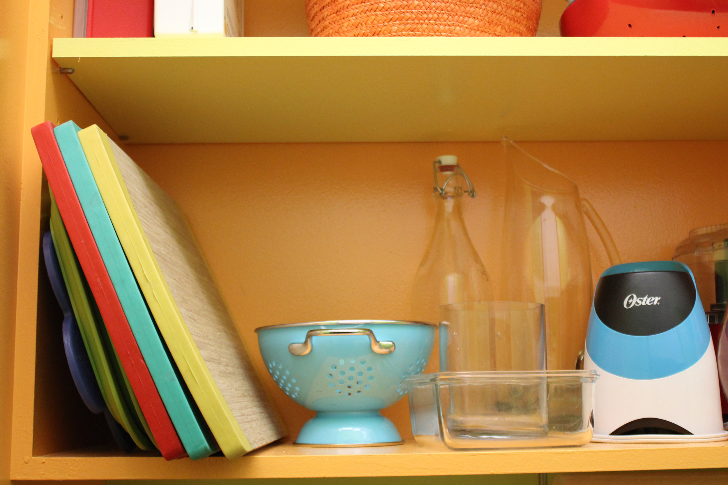
Here’s a lesson in color perception found in my own neighborhood. I recently photographed these pastel tanks in Allston, Massachusetts. I pass them regularly while on the Mass Pike, and I’m consistently surprised by them. They’re so incongruous with the landscape of Boston, which, in my mind, is primarily brown, brick red & Celtics green.

I googled “pastel pillars Allston” and found this article from The Boston Globe. The tanks belong to Houghton Chemical. The color palette was selected by the company’s staff in the 1960s and has stayed the same ever since.

In 2005 the owner said, “There is an expectation in people’s minds that industry is ugly. Therefore we wanted it to be an artwork ... There’s no reason other than to spread beauty and joy”.
Photos by Sophia Naureen Ahmad


BANANA REPUBLIC — Meet Their In-House Color Guru, Jenn Costantino


Banana Republic Color Guru In-House Jenn Costantino
 

Color is a small world. With social media, it’s become even smaller. I met Jenn Costantino in a professional context years ago, but it wasn’t until later, when we followed each other on Instagram, that I noticed a rare quality for colorists in the fashion industry. Jenn appeared to have a true passion for color, something that went beyond her job. Her point of view struck me as optimistic, vibrant and happy (also rare in the fashion industry!).

At Banana Republic, Jenn is known as the “Color Guru”. She has managed the brand’s color process for over five years. I wanted to talk to her about what a fashion colorist actually does, since it remains mysterious for many people. I’ve worked in this area of fashion myself, and I still struggle to explain it sometimes. Note: it has nothing to do with colored pencils.

Before moving to Milan earlier this year, I visited her in the color room at Banana Republic’s design office. We talked about her personal connection with color, as well as some essential aspects of her job, like using the right color language, building a solid palette and picking the perfect color name.

“It was probably the biggest compliment I got at Parsons. I was told, “You have a really good eye for color that takes years to develop, and you need to use it”.

“Colorist” is a job title in a few different industries. It usually makes people think of film or painting or hair color. What does it mean at Banana Republic?

Being the Design Manager of Color for Banana Republic means that I get to work with the design team and brand leaders on creating a beautiful vision that the customer is going to hopefully love, buy and create amazing memories with.

I'm not the fashion industry's typical colorist. I deal a lot more with concept. I’m very lucky to be able to have so much creativity in my job where I get to research trends and have a say in where I feel the brand needs to go trend-wise. I'm creating a road map or a blueprint of color for designers to follow. For womenswear, we have nine color palettes a season, so the designers need to know the specific direction for each part of the store.

Banana Republic has established itself as a classic American brand for decades now. How would you describe the color aesthetic of the brand?

The one color I would always associate with Banana Republic is olive because that is the heritage and culture of our brand. We will never not have a great olive in our store. It’s also important to keep the store looking elevated with other neutrals and positive pop colors.

 
The “color wall” is a point of reference for recently trending colors.

The “color wall” is a point of reference for recently trending colors.


What is the color selection process like?

Color is the beginning step for the design process every season. It starts with color. Each season, I work with two VPs on the color palettes. They put up tear sheets, they tell me what they like. Right now I'm doing trend research for Men's. I'm putting together images of what I feel are the important colors for the season. I’ll show that to the VP, she'll think of the concept, and whatever her concept is, I'll start the color palette based on that. It's a month long process. The designers get involved. I'm steering the color ship, but the design team and I work together to make sure we have the best colors in the store to represent their product.

 
Banana Republic Color Guru In-House Jenn Costantino
Jenn’s color palette exploration.

Jenn’s color palette exploration.


How does your job fulfill you creatively?

Creating color palettes for both the Men’s and Women’s design teams really lets me play with different colors. I get to work with such a creative team of designers. I’ve been here for 5 years and have yet to be bored. You have to be able to work with a lot of people in my job, especially because color is so emotional. Working with designers, they're emotional about what they do. You want to make sure the VP's vision is executed in the right way. Color plays a huge role in that.

Why is color an important skill for designers to have?

Color is very emotional, and it’s the first thing the customer sees. You want the color to entice the customer to the point that they want to keep on coming back to the store because we know exactly what they want.

What’s your philosophy for creating the perfect palette?

Neutrals first! Is your palette based in navys, greys or olives? Maybe it’s just a few different levels of creams. You need to create a strong base for the pop colors, then you slowly build in levels and add accent colors.

Banana Republic Color Guru In-House Jenn Costantino
Fabrics, yarns, threads, swatches - color reference tools come in many forms.

Fabrics, yarns, threads, swatches - color reference tools come in many forms.


What are some of the more specialized skills required in your job?

Once the palettes are done, if we're using clothing samples, it’s part of my job to go to the color library and match them to our standards. If it's not in our standards, I get it developed through a color service provider.

I evaluate color. A designer just came in because this white denim was coming out too yellow. She needed to know what to tell the mill, how to use the right color language. Designers come to me and say "We need a red that’s darker than this swatch", and I’ll explain that what they really want is a red that’s bluer, because that’s what the mill is going to add to make it darker. Having that technical knowledge is important because it helps you back up your creative vision.

 
Jenn shows Banana Republic’s Spring 2018 palette in a light box, a machine used to evaluate how color appears in various forms of light.

Jenn shows Banana Republic’s Spring 2018 palette in a light box, a machine used to evaluate how color appears in various forms of light.

Jenn evaluates a green swatch with a spectrophotometer, a machine that measures color in fabric, more specifically the amount of light intensity in each part of the color spectrum. This is how colorists determine if a fabric has the right amount of …

Jenn evaluates a green swatch with a spectrophotometer, a machine that measures color in fabric, more specifically the amount of light intensity in each part of the color spectrum. This is how colorists determine if a fabric has the right amount of red, green, yellow, or blue and what adjustments need to be made for the color to be production-ready.


Why are standardized colors used in fashion?

At a big company like Banana Republic, we have several mills that are producing the sweaters and the knits and the pants, etcetera. Everything has to fit in the store together. All the clothes are being dyed in different fabrics, and they're all being dyed by different people in different places. They need the color standard to measure against.

 
One of many greens found in Banana Republic’s color library. As tastes and trends evolve, fashion brands keep references of all colors, including those that are tried-and-true and ones that could be used in the future.

One of many greens found in Banana Republic’s color library. As tastes and trends evolve, fashion brands keep references of all colors, including those that are tried-and-true and ones that could be used in the future.


Why is it useful for Banana Republic to have a library of its own colors?

We're such a large company and we've been around for so long. Usually the bigger companies have color libraries. New colors go into the library every season, it keeps growing and growing. It's an amazing thing to have because every season, we can go back to them. It's like having a Pantone book on a really big scale. If we need a specific blue, we have over a hundred blues to choose from.

And each of those blues has its own unique name. Why is that important?

Imagine you have one little piece of fabric, and it's not labeled and it goes from here to a mill in India, and all the merchants have to reference that same color. It would be impossible without a name.

My recipe for naming a color is that you should be able to close your eyes and picture the color, like Rockaway Grey or Egg Yolk Yellow. You want the name to be as descriptive as possible. And it has to be an exciting name because eventually, it could be featured on the website. It could go all the way to the product level. You don't want to call a sweater Dirt Brown. Cappuccino would be a more elevated, sophisticated name for that brown.

Do you find that color names can also affect a creative team’s decision making?

Yes! Designers come in to the color library and they'll see a color like "Tickle Me Pink", and say “Oh, that's cute!” So it can affect the way the color is perceived.


Jenn quoted in Banana Republic’s email promotions for Summer 2018.


So, when did you first realize you had a strong eye for color?

It was a teacher at Parsons that pointed it out. I studied fashion design there. I had a critique, all the students had their illustrations out. I was bad at draping, I was bad at patternmaking. Those were not my strong suits. I went to Parsons because I love to draw and paint. My drawings were good. It was probably the biggest compliment I got at Parsons. I was told, “You have a really good eye for color that takes years to develop, and you need to use it”.

Office moodboard.


You’re a native New Yorker, but your taste in color is very California - sunwashed oranges and yellows, ocean blues. Your Instagram feed is filled with palm trees and surfboards. Where does that love of California come from?

My mother introduced me to the music of the Beach Boys at a very early age.  I also started watching surf movies like Endless Summer and some Elvis Presley beach flicks. From then on, I was always drawn to surf culture and the beach. Palm trees, surfing, and the colors that are associated with beach life, I equate with peace and happiness. It was where I always escaped to in my dreams growing up. I try to surround myself with as much beach culture as possible since it brings me so much joy.

Posts from Jenn’s Instagram feed. Follow her @jennsmusic.


Could you describe a time when you had a strong emotional reaction to color?

I think it honestly was when I traveled to the Caribbean for the first time when I was in college. I didn’t know water that blue and bright existed anywhere! It filled my soul with so much peace. How can anyone be unhappy looking at that?

How did that moment influence your taste and approach to color now?

I don’t ever want to put dull or drab colors in a palette. You want something that makes you feel beautiful and happy when you look at it. At Banana, we want to make our customers, both men and women, feel beautiful and confident. You always want to evoke a positive feeling with color in retail.

Banana Republic Color Guru In-House Jenn Costantino Swatches MLab
 

“Color is very emotional, and it’s the first thing the customer sees … You always want to evoke a positive feeling with color in retail”.

 
Banana Republic Color Guru In-House Jenn Costantino Swatches MLab
 

You’re also a singer/songwriter. Have you ever experienced synesthesia? Is there any connection between your love of color and music?

I have written songs about color, but I don’t see color when I sing or hear music. I can imagine it, but I keep both senses very separate. When I sing I focus very much on the sounds and creating a beautiful melody, and it’s very personal. When I create color palettes, I of course use what feels good to me, but because I work for a brand with such a strong customer, I focus more on what’s going to make the customer feel great.

Lastly, where else do in your life do your color skills come into play?

I never stop being inspired by colors I see. I see color palettes or make note of new exciting colors I see in everyday life, as I’m sure you do as well! My job also comes in handy when friends or family need help choosing paint colors for their house!

P.S. Check out Jenn’s favorite Instagram accounts for color inspiration:

@kimkeever.art, @_jujujust_, @neohumanity, @voguerunway, @chromayoga


EILEEN FISHER — Studio Visit with Color Designer Chris Costan


I first met Chris Costan years ago, back in my temping days. Sent by a staffing agency to meet her at Eileen Fisher, I was the potential replacement for her assistant, who would be out for a few months. At the time, I had a long-term gig in place, and I was afraid to give it up. Walking away from the chance to work with Chris was not easy — I knew that she was someone I could really learn from. In addition to being a color designer, Chris is a visual artist with a career spanning decades.

The work table.

I remember being deeply impressed by her workspace, known as the Trend and Color Studio. A wild mix of images, textures, unusual objects, books and color swatch cards with handwritten notes. There was a softness and tactility to it, a thoughtfulness. I hadn't yet seen an inspirational space so fully realized in a fashion studio.

Years later, it turns out that I now work in the same building as Chris. After a re-introduction by her coworker (Thanks Maggie!), I asked Chris if I could photograph her current studio. She gave me access to her workspace, generously answered my questions and shared commentary on some recent pieces from the Eileen Fisher lookbook.

Color palettes in process.

Color swatches organized by hue.

Trend books.

Library of color swatches and samples.


Q&A with Chris Costan


Self-portrait provided by Chris.

Self-portrait provided by Chris.

As a visual artist, how did you start out working in color design/fashion?
Having the experience of a life in fine art, I had the needed knowledge, cultural awareness and expertise to be able to design color at Eileen Fisher. I have, by nature, an aptitude for fashion and trend. The job also requires a great deal of organizing and multitasking. All that said, I was referred by another artist who was familiar with my skill set. Helen Oji, also employed by Eileen Fisher.

How has your work at Eileen Fisher informed your personal work as an artist?
The two disciplines of my job as color designer and my own personal work are separate but equal. In other words, there is a great deal of cross pollination between my job and the artwork. And that's a wonderful thing, because each is the richer for it. As an artist or a designer, one takes in the world around, absorbing and applying that which is seen, heard or learned. At the same time I am always aware of keeping the fashion/design-y portion at bay in the art practice. Let it in, but not too intensely. I have been influenced in my own work by material usage. Always having had an affinity for fabric, textiles and associated decorative notions, I've seen that these materials have become more integrated into the art as I have progressed. And I often procure excess materials that are discarded in the design studio and use them in my own personal studio.


Has it changed the way you see or apply color?
Necessarily, yes.  I love the vicissitudes of trend and am more acutely aware of them as it is a part of my responsibility in the job.  I constantly look at the way people on the street dress and, in my mind, rework how they have put color (and styles) together. I also worked at MTV Animation for a while and was responsible for color on Daria. During that time, I would ride the subway looking at hair colors, shoe colors and general color styling in order to apply those combos to the show.  Based on my descriptions, you can see how ALL is factored into the mix.

Eileen Fisher is known for being understated. How do you incorporate color trends into your work? What are the challenges?
Eileen Fisher clothing alludes to trends, as opposed to adhering to them.  We are interested in elegance and wearability in the clothing. In the design department, we digest and interpret the trends and synthesize which trends mesh with the brand. I make great efforts toward incorporating important and current trending colors while building an aesthetically beautiful palette. Factoring in the sales and wardrobing needs of the brand are also essential. The job itself is challenging, but incorporating trends with discretion is simply a matter of prioritizing which main trend ideas can be used within a season. 

Eileen Fisher is known for its neutrals as well as the distinctiveness of its colors. Therefore I am perpetually thinking about interesting color combinations which appear within a delivery or a season and how they will mix together visually, either in the store or on the body.  I mix colors so that they can be worn with each other, or with the given neutrals.  My preference is to mix a color with neutrals.  But the other way works as well.


What is most rewarding about your job as a color designer?
That cross pollination I was talking about above. In addition, the pureness of aesthetics within my role at Eileen Fisher. As an artist, this is a wonderful job.

What is your favorite object in your studio?
Everything, because the objects, the wall images and the palettes are all a source of inspiration. My eye alights on something ... an object, a picture, or a building, and I immediately get ideas.

I understand Eileen Fisher is working towards responsible dyeing as part of its sustainability initiative, Vision 2020. What does sustainability mean to you? How do you apply those principles in your work?
Sustainability is paramount to the Eileen Fisher brand.  In 2016 almost half of our dyes involved the use of safe chemistry. I do feel lucky to work for a company that tries as hard as it can to have a positive effect on the environment. We do feature some natural dyes in our accessories and utilize natural undyed cashmeres.

In the past, in my role as color designer, I felt strongly that as a brand, we should be working toward offering some naturally dyed garments. A natural dye pod will be featured in some retail stores in April 2017. It is difficult to use natural dyes for a company this large, as many of the colors are fugitive by nature. But the use of natural colors is intriguing and is linked to preserving cultural traditions.

What works of art have inspired you recently?
Lots.  Kerry James Marshall at the Met Breuer, Raymond Pettibon at the New Museum, Katherine Bradford at Sperone Westwater Gallery.  Bonnie Lucas's little retrospective at JTT Gallery, and scattered pieces I've seen of Judy Simonian's paintings recently. Also, frescoes in the Shekhawati region of India that I saw on a recent visit to that country. Always, the architecture of parts of India. All inspiring.

Are there any colors on the rise that you love? What's your favorite color of the moment?
I often like colors which are trending. The cosmetic colors/skin colors have been styling for maybe 4-5 years and going strong. I like those paired with neutrals and am a fan of blues and pinks.


Below, Chris shares her thoughts on 5 recent looks from Eileen Fisher.

FROM LEFT —

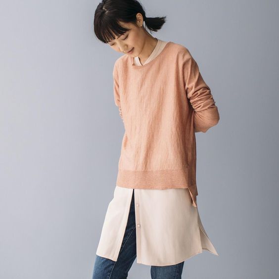
Look 1: "This image features jeans styled with a 'cosmetic' color. Colors which I have labeled ‘cosmetic’ have been trending for quite a while, with many wanting to wear the myriad colors of skin. They range from pinky to sandy with a pink cast. Everyone loves them right now. Pairing these colors with white or black is another way to make them work for you".

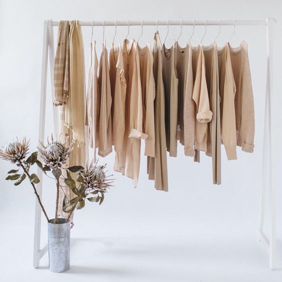
Look 2: "This image features a cosmetic range of colors and demonstrates how one can mix a natural colored cashmere sweater with our colors Alabaster and/or Dune".

FROM LEFT —

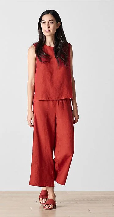
Look 3: "This is a monochromatic look, which is an important trend right now. The color Serrano is intended to punctuate a pinky-light red color story, in a particular delivery for Spring 2018. It’s a refreshing and crisp look. This outfit in Serrano creates a 'searing' effect in the heat in the midst of summer".

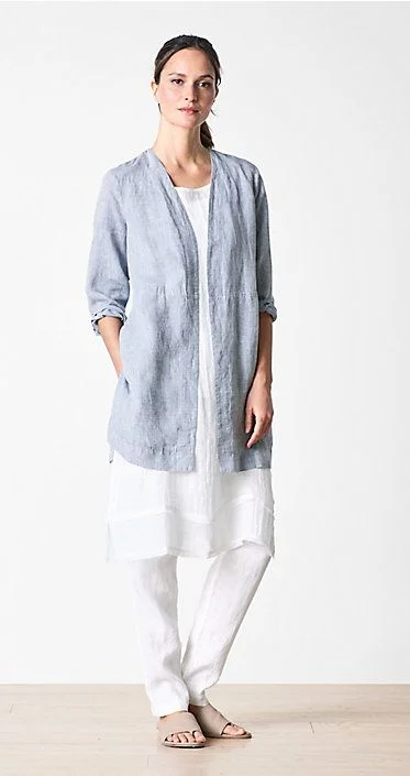
Look 4: "We love white in summer, and here it's paired with chambray, which is created by cross dying two colors―white and a darker blue, which then creates a faded look in the fabric. This is then combined with a white look again, giving it a fresh, summery appearance".

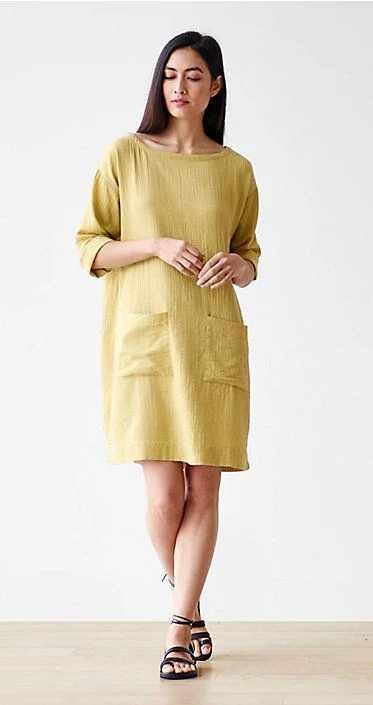
Look 5: "Papyrus dress--although this is a 'color', it can have a neutral appearance. It can mix with another neutral type color, such as Dune or Natural and then can create gorgeous subtlety to an outfit".

Learn more about Chris and her work at chriscostan.com.


PUBLICOLOR — Office Tour and Q&A with Founder Ruth Lande Shuman


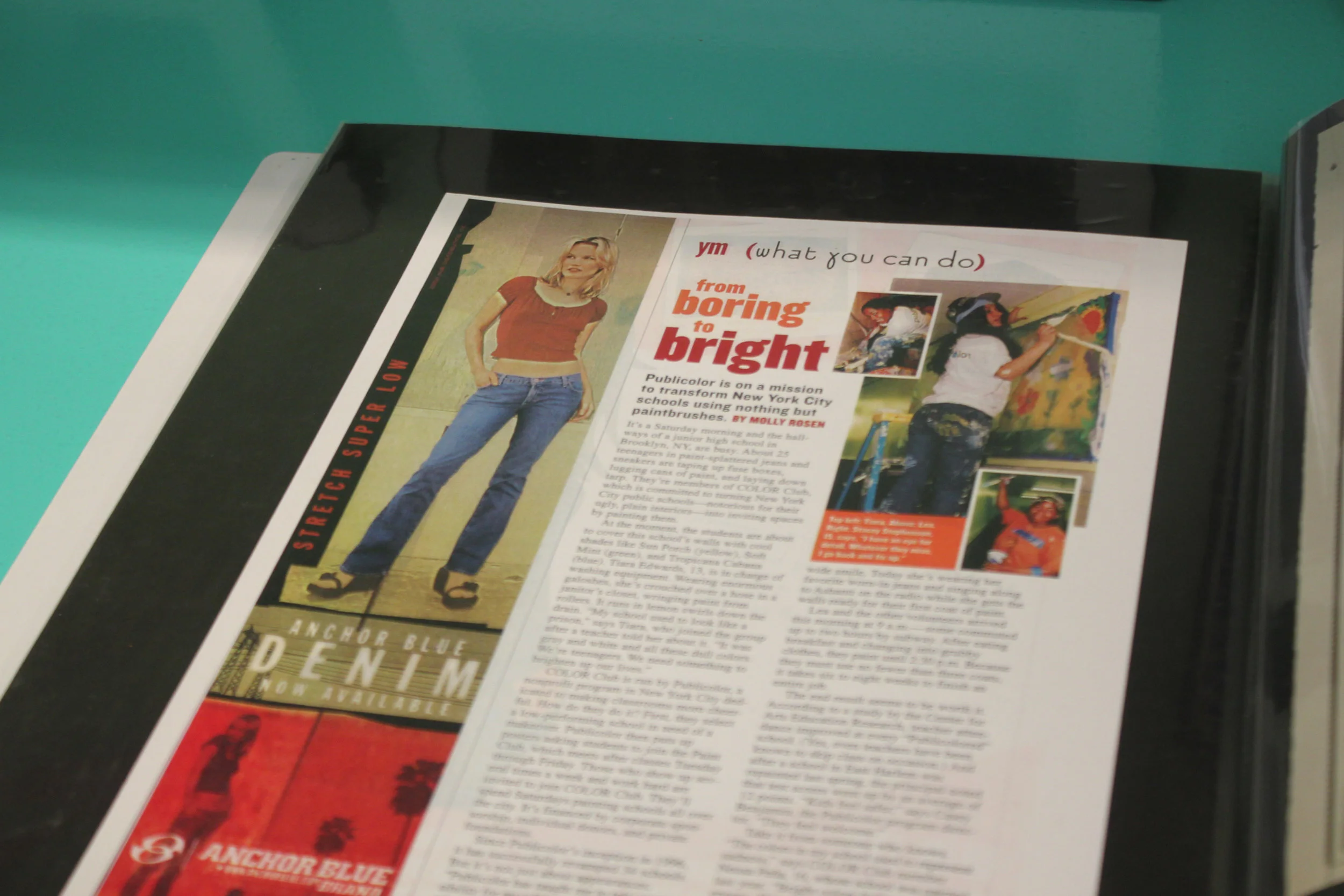
My introduction to Publicolor happened in high school. I read about it one of my favorite magazines at the time, YM.

The ethos of the organization resonated with me — liven up drab, underserved schools with color, and consequently, boost the students' mood, attendance, and test scores. A simple idea, yet deeply affecting. It sounded like a win-win. I remember talking to my friends about it in the cafeteria, wishing there were a program like it in our city.

"From Boring to Bright" in YM magazine. My first introduction to Publicolor, spotted in a book of press clippings.

"From Boring to Bright" in YM magazine. My introduction to Publicolor, spotted in a book of press clippings.

I've lived in NYC for over six years now, so I'm not sure why it took me so long to get involved (seems like a no-brainer). But I'm so glad I did. 

After volunteering at a painting day this past October, I was invited to the Fall Crit, a showcase of design projects created by students in Summer Design Studio. It’s one of Publicolor's many youth development programs. 

Stepping into the midtown office, I felt as if I'd been transported into another world. It felt alive. I instantly knew I wanted to photograph the space.

I'm excited to share these photos, along with the first-ever interview on my blog, a Q&A with Ruth Lande Shuman, the founder and visionary behind Publicolor.

To get involved, visit publicolor.org.

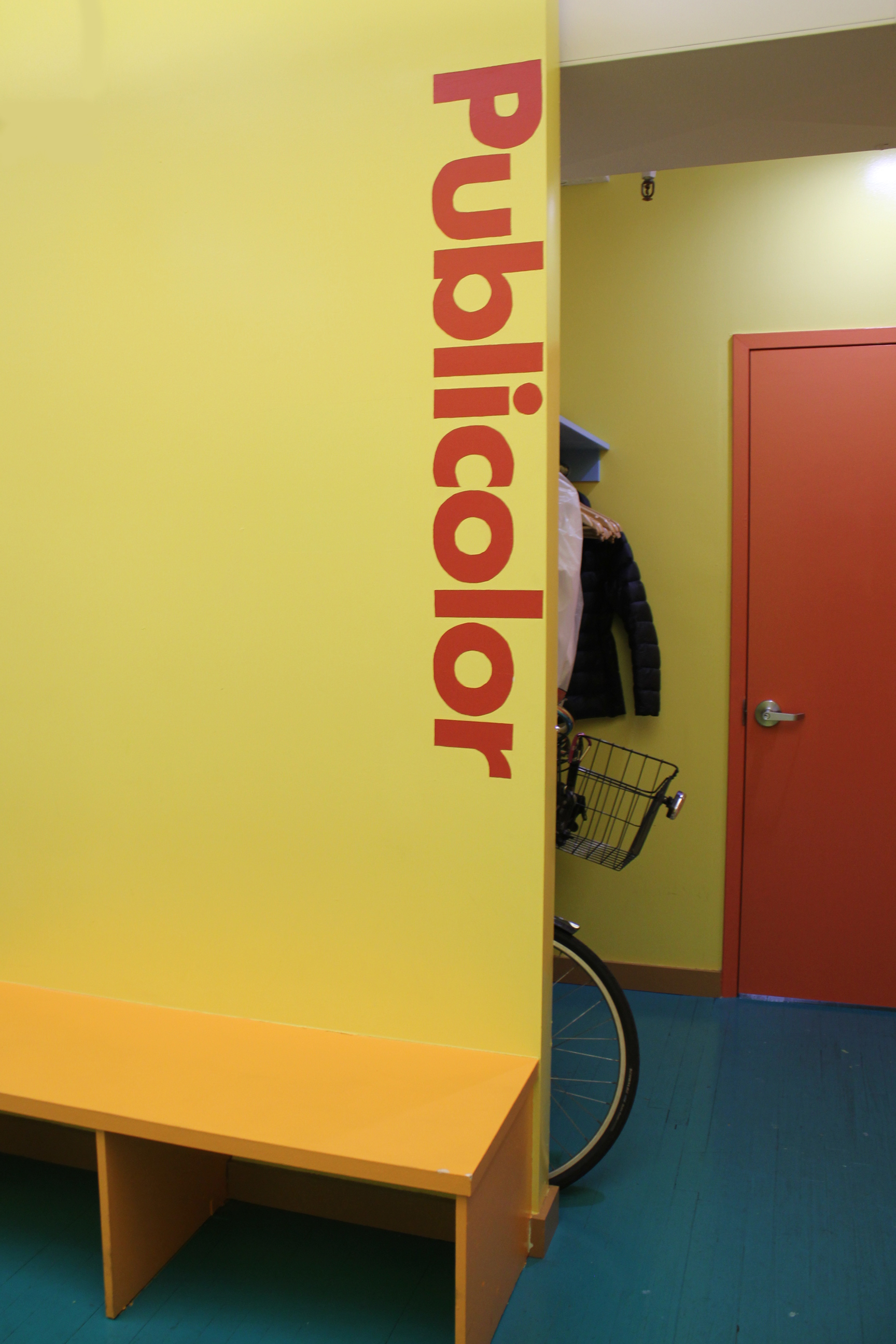
Welcomed with the Publicolor logo, a design by the iconic Massimo Vignelli.

Welcomed with the Publicolor logo, a design by the iconic Massimo Vignelli.

PUBLICOLOR-NYC-HEADQUARTERS
"Color Design for Roosevelt High"

"Color Design for Roosevelt High"

PUBLICOLOR-NYC-HEADQUARTERS
A piece by artist Gaetano Pesce, friend and collaborator of Ruth Lande Shuman.

A piece by artist Gaetano Pesce, friend and collaborator of Ruth Lande Shuman.

PUBLICOLOR-NYC-KITCHEN
PUBLICOLOR-NYC-KITCHEN-HEADQUARTERS
PUBLICOLOR-NYC-HEADQUARTERS
PUBLICOLOR-LOGO-NYC-HEADQUARTERS
PUBLICOLOR-NYC-HEADQUARTERS
PUBLICOLOR-NYC-HEADQUARTERS-RAINBOW
PUBLICOLOR-NYC-HEADQUARTERS

Q&A with Ruth Lande Shuman, Founder of Publicolor

Photo c/o New York Social Diary. Click the photo to read a fantastic interview with Ruth from 2012, which features many beautiful photos of her home.

Photo c/o New York Social Diary. Click the photo to read a fantastic interview with Ruth from 2012, which features many beautiful photos of her home.

The color palette of the office is your design. Everything is rich with color, even the staplers and coffee mugs. What mood or feeling did you want to convey for yourself and your staff?

Happiness +  Energy.

I love the wooden color palettes you created for some of the older building designs. How do you go about creating palettes for each school that you work with?

Usually I work with the students to create the palettes.

For me, color is a language, sometimes mysterious. What is one thing about color that you wish more people understood? 

It would be wonderful if more people appreciated the power color has to affect our moods + behavior.

What was a personal highlight at Publicolor for you this year?

Knowing that 97% of our students graduated high school on time + 100% went on to college or a post-secondary accreditation program.

What works of art have inspired you recently?

A recent visit to Gaetano Pesce’s workshop was enormously invigorating – so much energy!

I had to ask. What's your favorite color of the moment?

Red has always been my favorite color. I never pay attention to the colors of the moment.


JOSEF ALBERS — Perception Through Iteration, Color Workshop


In visual perception a color is almost never seen as it really is—as it physically is. This fact makes color the most relative medium in art. In order to use color effectively it is necessary to recognize that color deceives continually.
— Josef Albers

I recently attended a workshop based on the teachings of color master Josef Albers.

The workshop, titled Perception Through Iteration, was led by Fritz Horstman, the Artist Residency and Education Coordinator at the Josef & Anni Albers Foundation. At Manhattan's Drawing Center,  Fritz took us through a few exercises from Albers' groundbreaking book Interaction of Color.

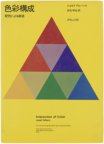
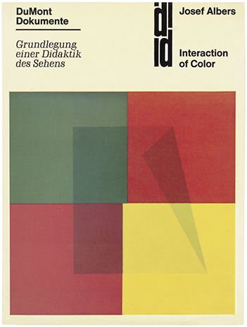
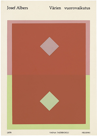
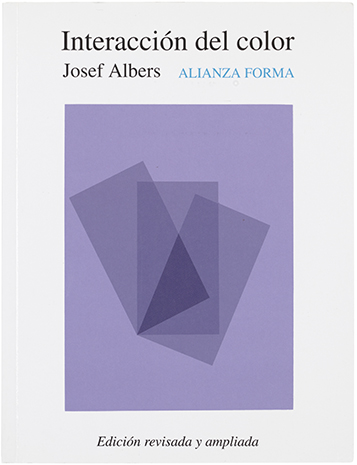
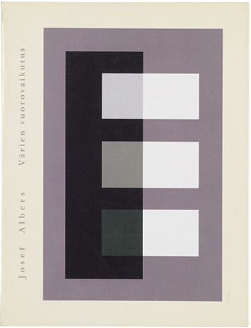
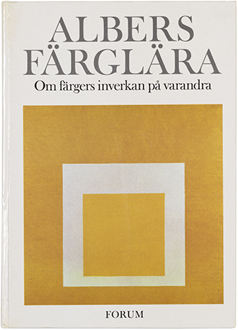
Various editions of Albers's book, which was published in many languages. See more here


I was introduced to Albers' work years ago, in a color theory class at Parsons. In the work I do now, arranging color and creating palettes is less a formal practice and more a result of instinct and mood. I felt I needed a refresher. As Fritz explained, for Albers,  "color was material". This idea resonates with me, as I've come to realize that nearly every photograph, collage or moodboard I make is driven by color. Color is my preferred language and medium.

For each exercise, the students shared a box of Color-aid, matte sheets of paper that come in brilliant standardized colors. This is the same paper Albers taught with, and it's become a standard teaching tool in art and design classes. I still have my box from that color theory class.

Josef Albers Color Workshop Color-aid Paper

The colors are so rich and such a delight to work with. In the presence of Color-aid, you'll hear a lot of gasping, oohs and aahs, and things like, "It's too pretty to cut!'.

Josef Albers Color Workshop Color-aid Paper

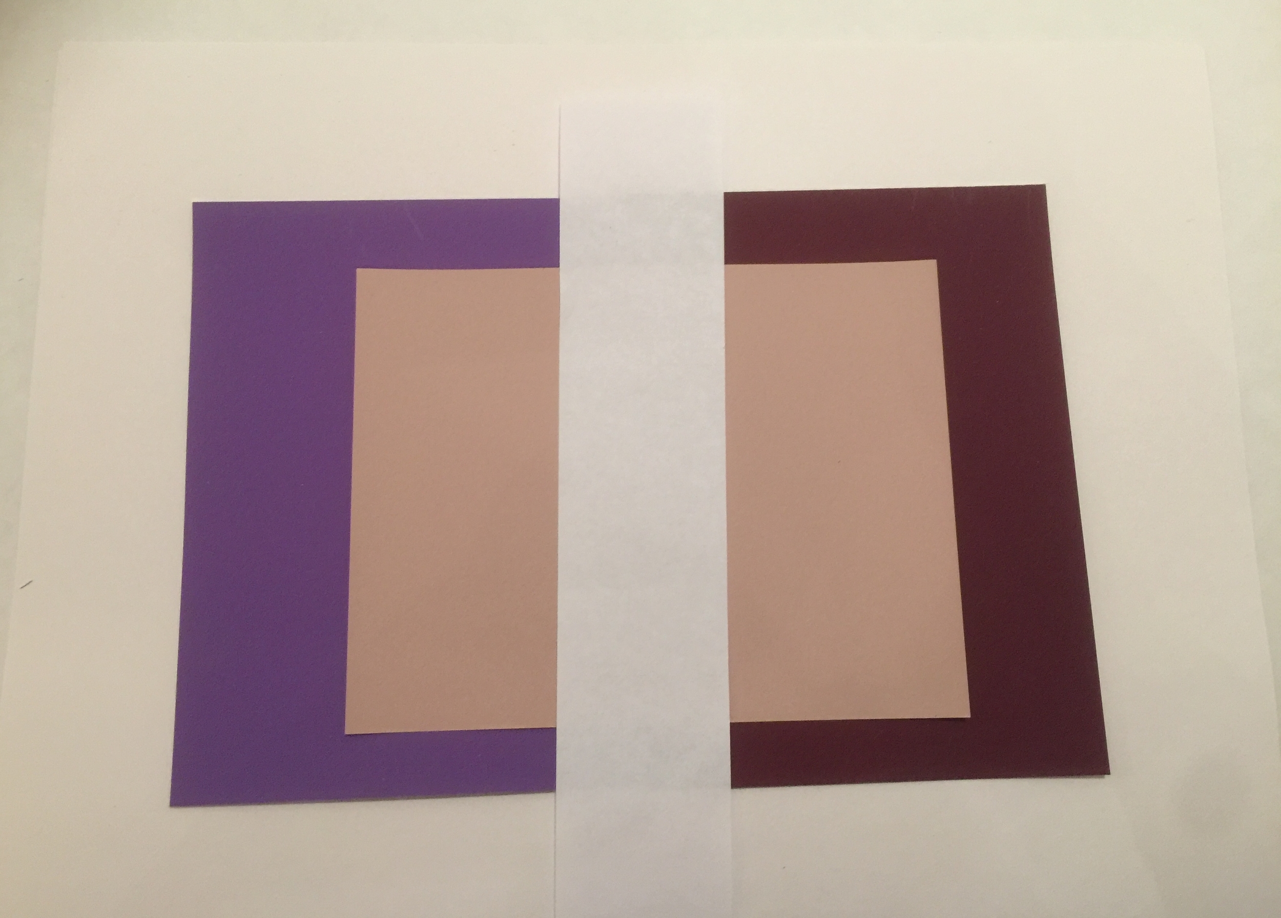
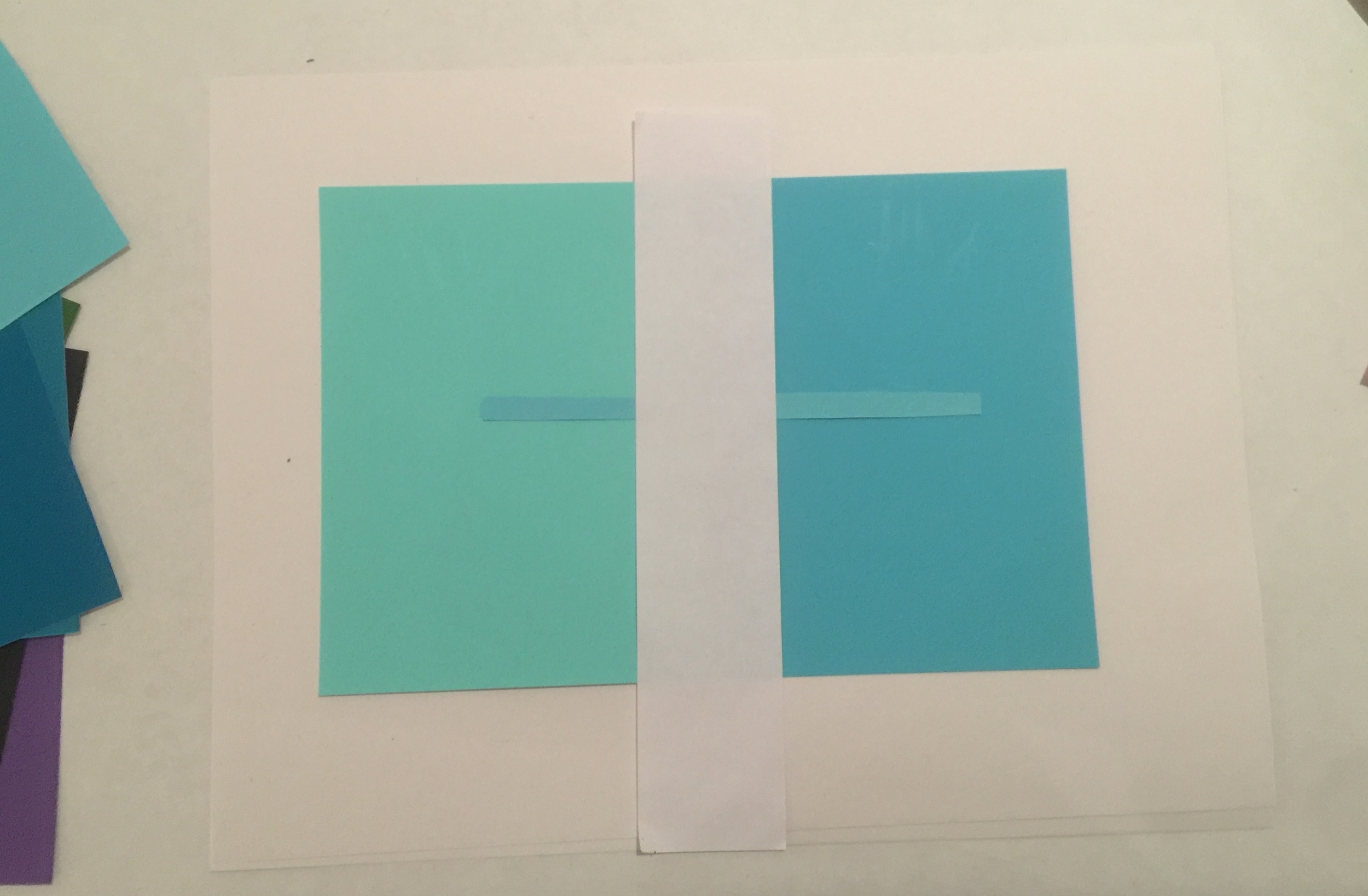
Exercise #1: Make Three Colors Appear as Four

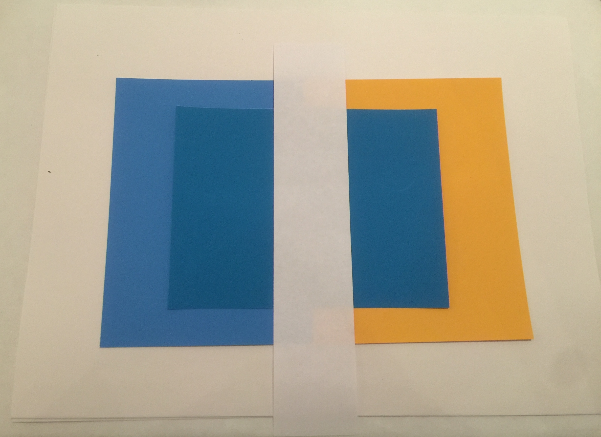
Set two colors side by side. We'll call these the host colors. Then place a third color on top. This will be the sample color. With a thin strip of white paper, separate the sample color into two distinct colors.

It took a few tries to get it right —

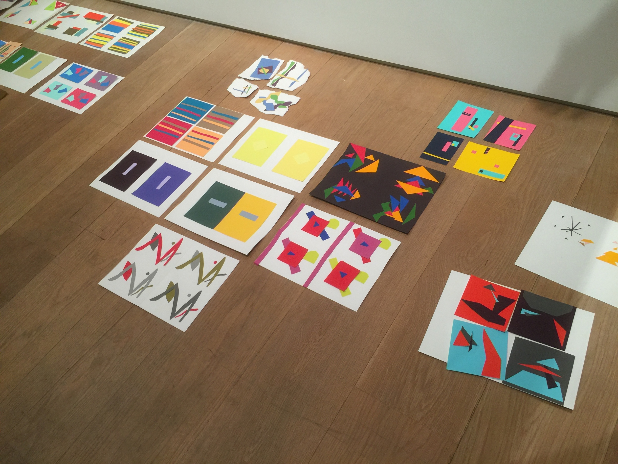
Josef Albers Color Workshop Exercises Color-Aid

According to Fritz, if the sample color shares qualities with one of its host colors, you are more likely to see a visible shift. Another hint: the smaller the sample color is, the more light it will absorb from its host color.

I settled on the three cool colors below. On the left, the sample color looks green. On the right, it shifts subtly to a cooler blue.

Josef Albers Color Workshop Exercises Color-Aid

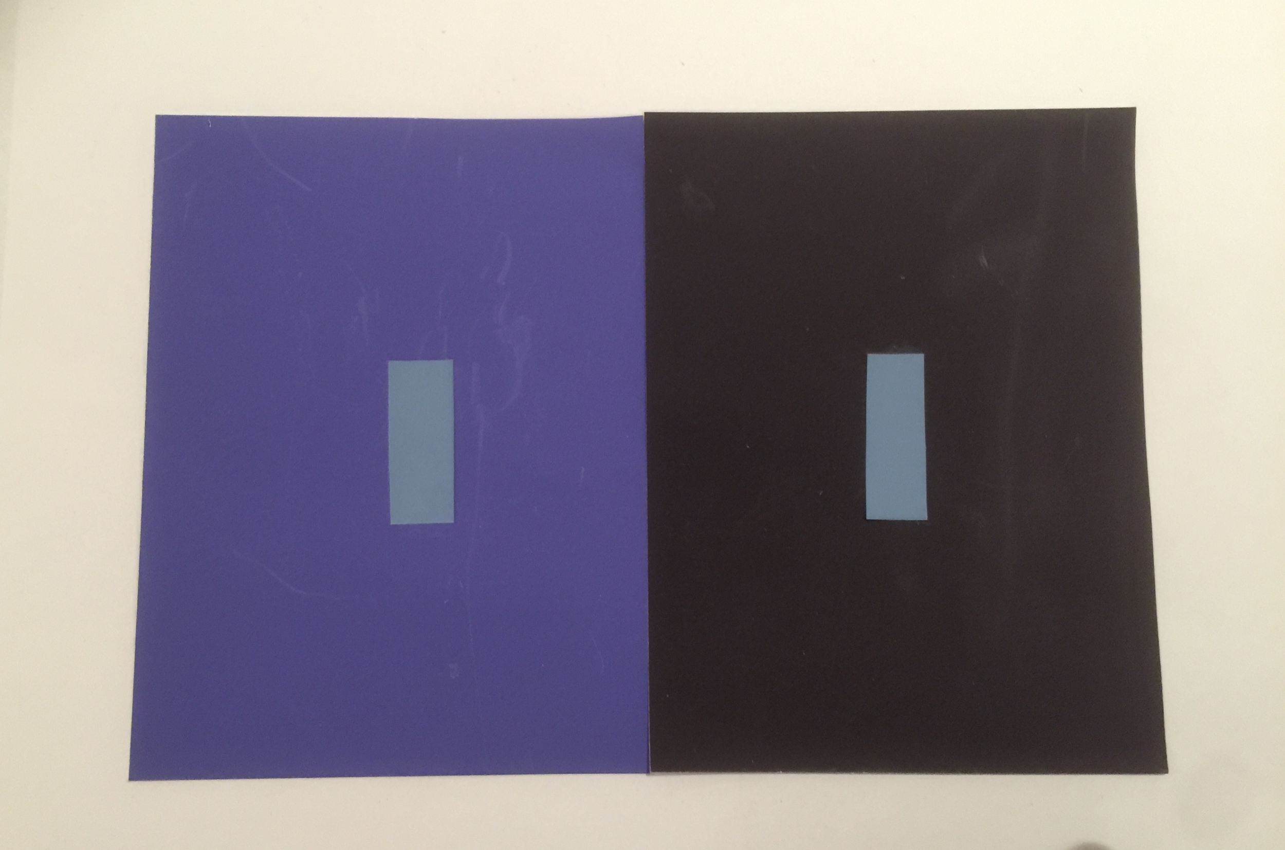
Exercise #2: Make Three Colors Appear as Two

Set two host colors side by side. Then place a third color on top. The goal is to make the sample color on each side resemble the opposing host color. 

After many tries, it became evident that the the more similarities all three colors shared, the easier it would be to pull off.  How did I do?

Josef Albers Color Workshop Exercises Color-Aid

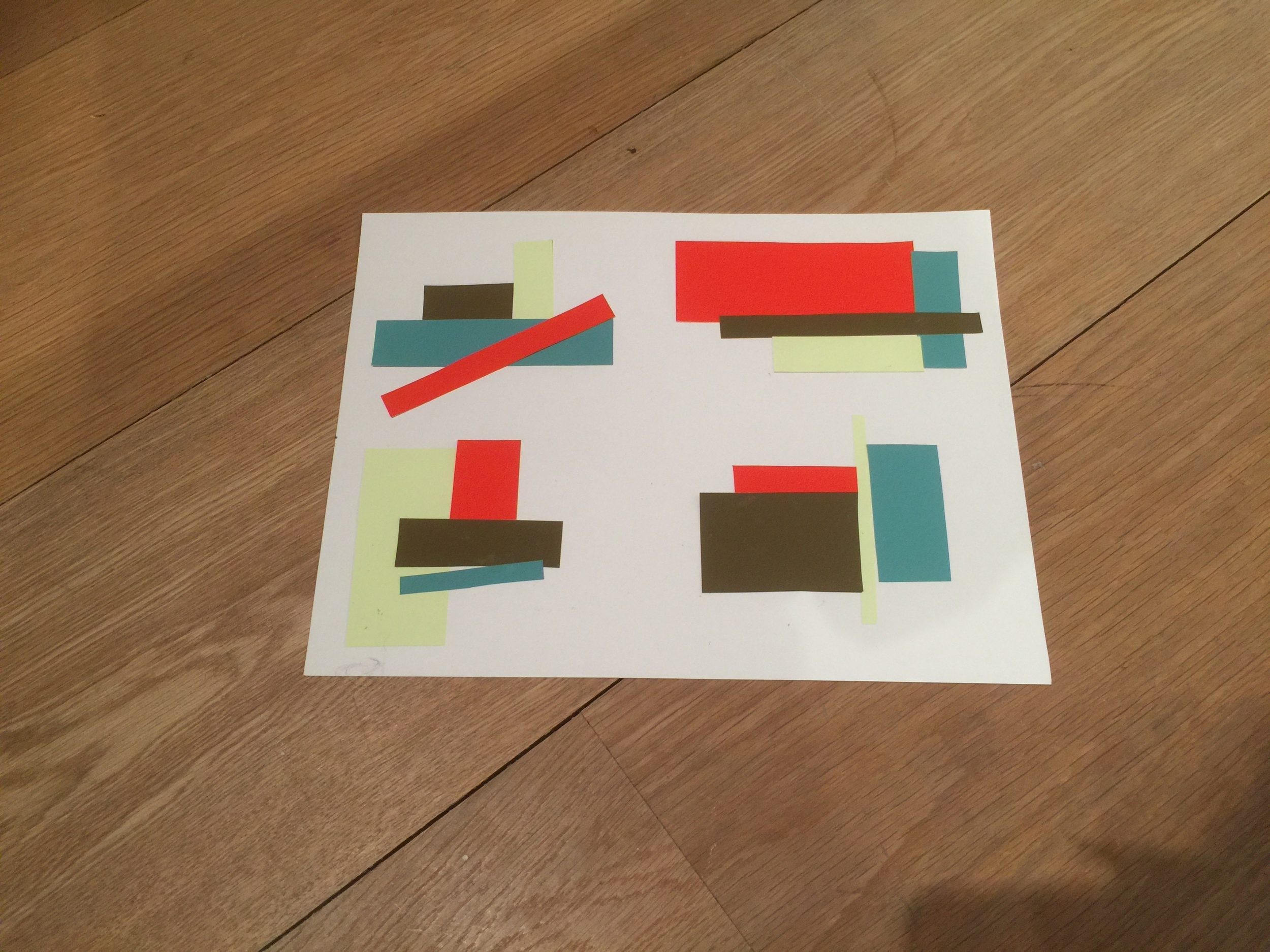
Exercise #3: Make Four Compositions with Four Colors

In the last exercise, we were asked to pick four colors at random and trade them with a partner. Then, create four distinct compositions, using similar shapes for each one. The idea was to explore the relationships between colors that don't necessarily share similarities in hue, value, or saturation. Or, to work with colors we're not naturally drawn to. For me, that would be the slime green you see below.

Josef Albers Color Workshop Exercises Color-Aid

After seeing my fellow students' work, I realized my choice of rectangular strips was pretty conservative. With a quick, simple exercise, you can see some interesting ideas taking shape here. 

Josef Albers Color Workshop Exercises Color-Aid

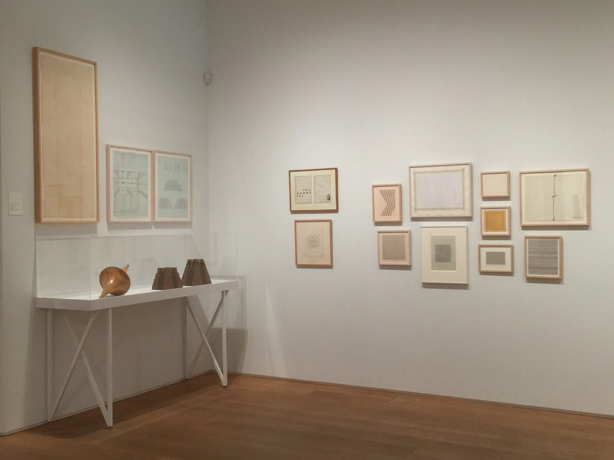
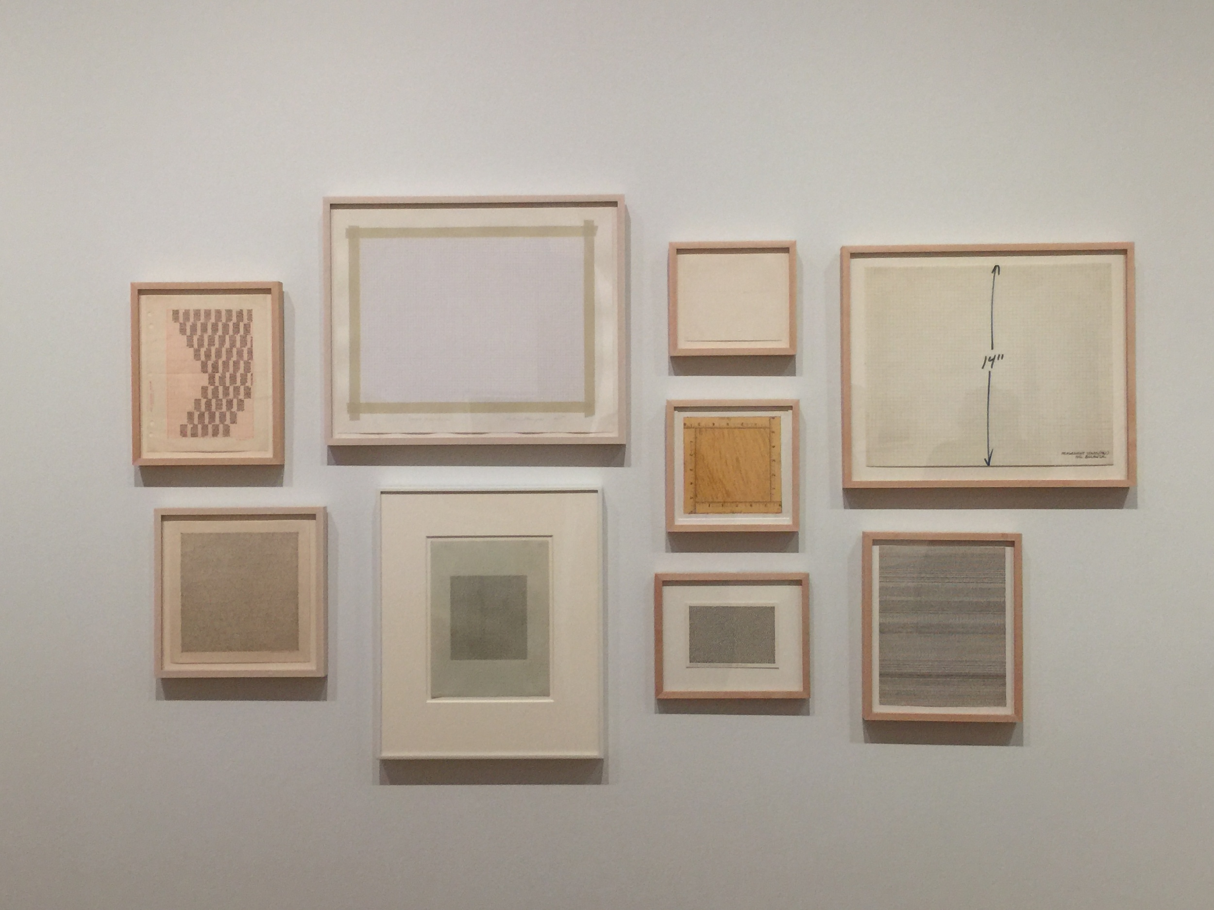
The backdrop of this workshop was The Drawing Center's gallery space, currently housing Drawing Dialogues: Selections from the Sol LeWitt Collection. The collection features pieces by artists like Eva Hesse and Dan Flavin. I love the feeling of the space.

Drawing Center New York Sol Lewitt Drawing Dialouges

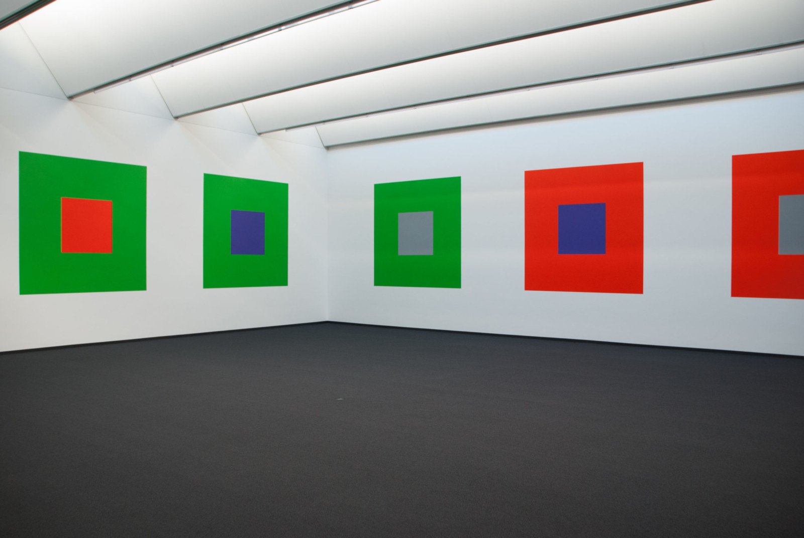
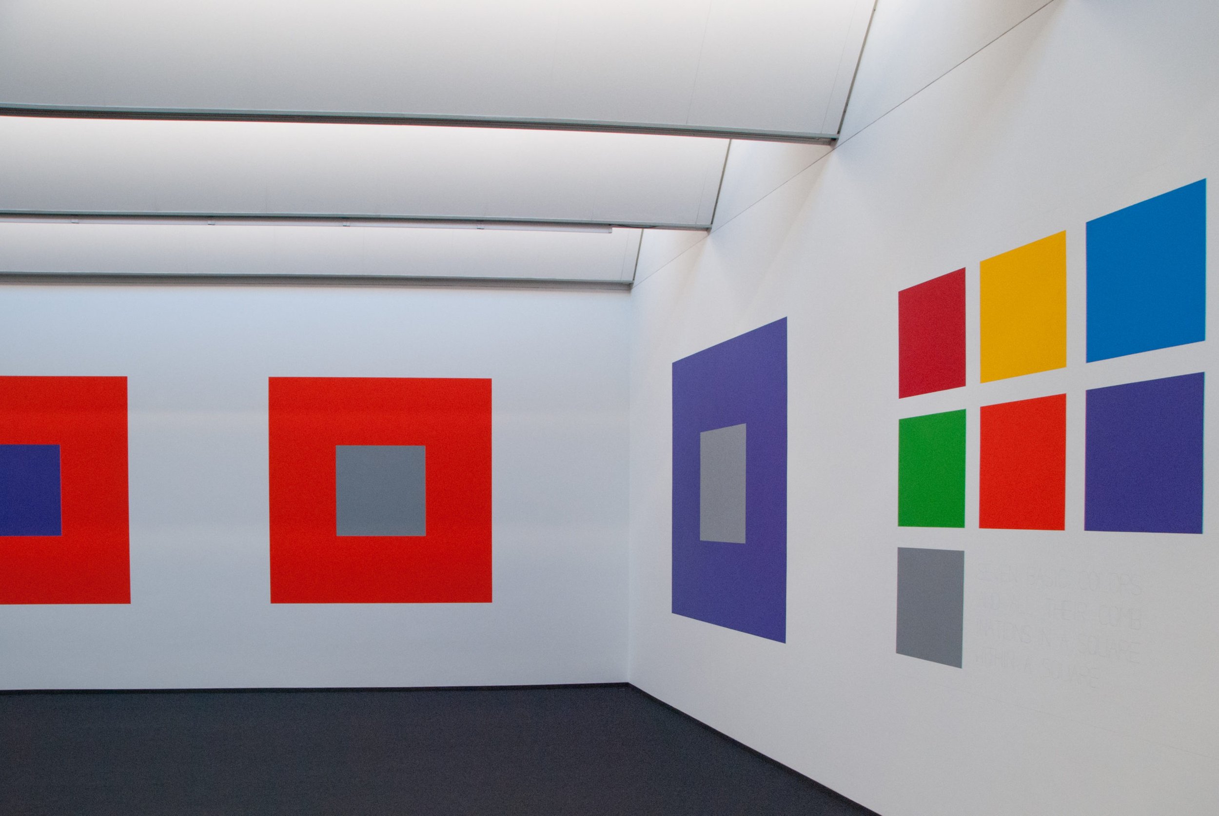
Sol LeWitt never studied under Albers, but was influenced by his work. In 2005, LeWitt's work titled Seven Basic Colors And All Their Combinations In A Square Within A Square was unveiled at the Josef Albers Museum in Bottrop, Germany. The wall mural, commissioned by the museum, was LeWitt's homage to Albers (see images below).

Thanks to The Drawing Center for having me!


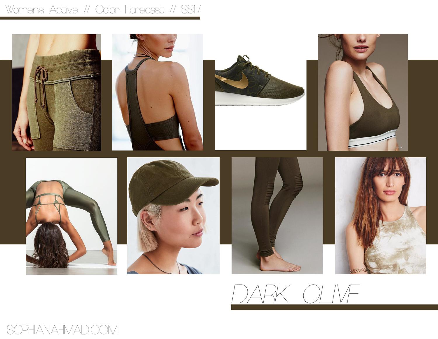
COLOR TREND REPORT — 8 Key Colors for Women's Active Spring/Summer 2017


Here’s a recent project I completed, reporting on key colors for women’s activewear. Designed in Photoshop.