NEW BALANCE — FW21 Color, Concept + Trend Direction
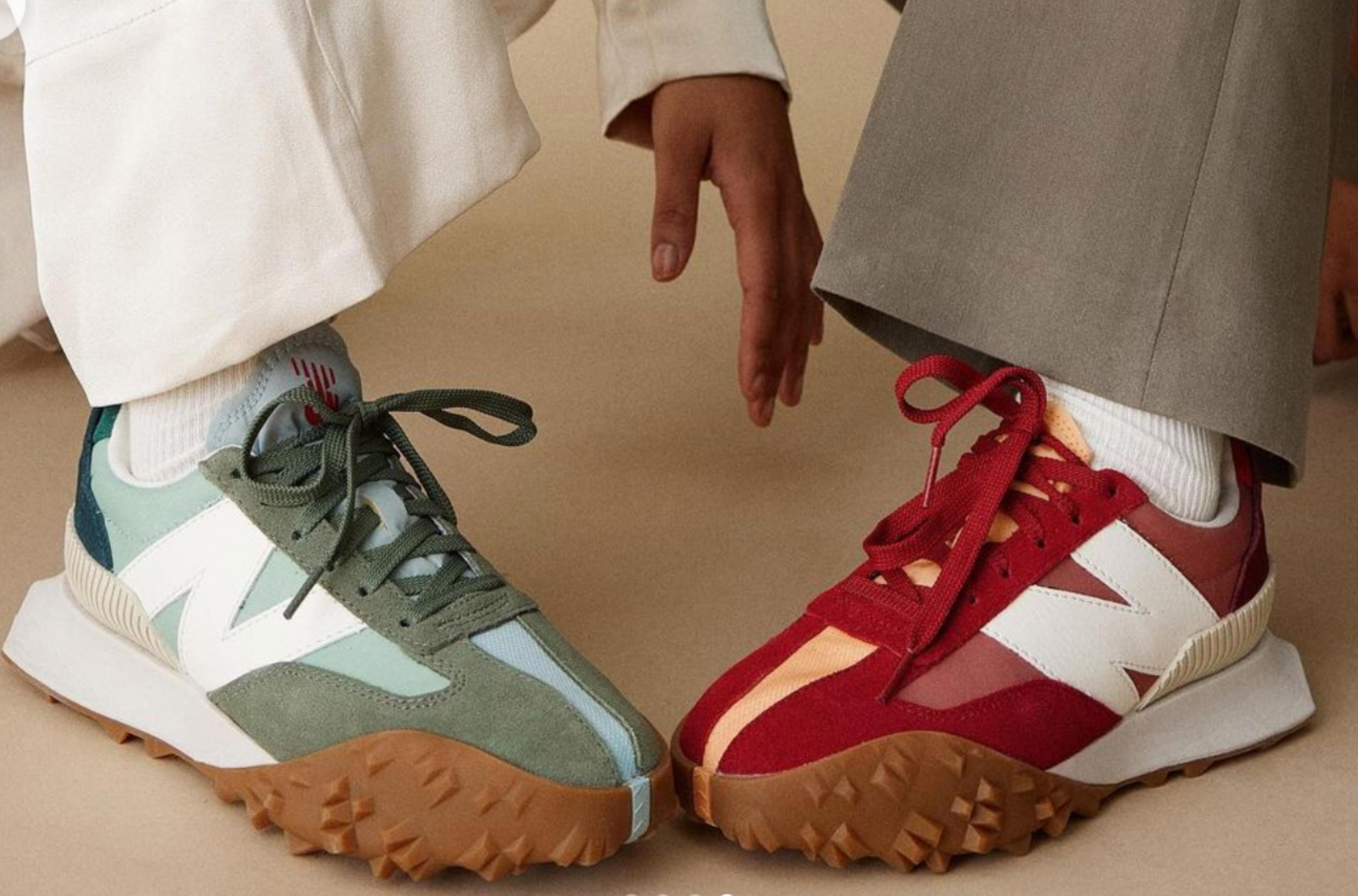
Image via nakedcph.com
BRAND: New Balance | newbalance.com | Boston, MA
DATE: 2019-2020
INDUSTRY: Apparel and Footwear — Men’s, Women’s, Kids
ROLE: Design Apprentice — Concept, Color and Materials
PROJECT: As an apprentice at New Balance, I worked with a small team of brand leaders to create key color, concept and trend directions for the Fall/Winter 2021 season. Images below titled ‘TEAM COLOR DIRECTION’ were included in a seasonal kickoff presentation distributed to global design teams, later influencing all product categories — Lifestyle, Performance, Apparel, Footwear, Men’s, Women’s and Kids.
DELIVERABLES: Color Concepts, Color Palette Selection, Image Research, Moodboards, Copywriting, Color Naming, Color Matching and Development, Color Digitization
COLOR SPACE — REDS
MY COLOR RESEARCH
KEYWORDS: lush reds, juicy, sensual, layered monochrome color
CONCEPT TEAM’s COLOR DIRECTION
KEYWORDS: bloodstone + peach, lush, juicy reds and tart pinks, burnished, anodized, sleek finishes, vivid accents
DESIGN TEAM’S ColOR APPLICATION
New Balance product images are meant to illustrate color concepts only. Colorways were not designed by me.
COLOR SPACE — GREENS + NEUTRALS
MY COLOR RESEARCH
KEYWORDS: pale harvest, gourd greens paired with pale earthy browns, washed out
concept TEAM’s COLOR DIRECTION
KEYWORDS: monochrome, rich, layered darks and textural neutrals, subtle off-tone pairings feel rich
DESIGN TEAM’S COLOR APPLICATION
New Balance product images are meant to illustrate color concepts only. Colorways were not designed by me.
COLOR SPACE — HERITAGE SPORT
MY COLOR RESEARCH
KEYWORDS: harvest, autumnal reds, oranges, yellows and greens, fall foliage, butternut, pumpkin
concept TEAM’s COLOR DIRECTION
KEYWORDS: harvest glow, rich seasonal shades in unexpected pairings, classic with a twist and a punch
DESIGN TEAM’S COLOR APPLICATION
New Balance product images are meant to illustrate color concepts only. Colorways were not designed by me.
COLOR SPACE — BRIGHTS
MY COLOR RESEARCH
KEYWORDS: playground, pared-down kinder-colors, midtones, translucent slime colors, more elevated palette
concept TEAM’s COLOR DIRECTION
KEYWORDS: playground, analog brights in bold combination, a sense of childhood nostalgia, expressive + playful
DESIGN TEAM’S COLOR APPLICATION
New Balance product images are meant to illustrate color concepts only. Colorways were not designed by me.
COLOR SPACE — PASTELS
MY COLOR RESEARCH
KEYWORDS: winter stillness, soft pastels, cozy, fuzzy, puffy, diffused light
concept TEAM’s COLOR DIRECTION
KEYWORDS: winter pales, color feels still, fuzzy, chalky, neutral-adjacent shades work beautifully for both genders, reduce, worn, patina
design team’s COLOR APPLICATION
New Balance product images are meant to illustrate color concepts only. Colorways were not designed by me.
COLOR SPACE — TECH-INSPIRED
MY COLOR RESEARCH
KEYWORDS: digital simulation, influenced by digital characters and avatars, gaming, cool purples and blues, iridescence
CONCEPT TEAM’S COLOR DIRECTION
KEYWORDS: digital fable, dark, digital, hyper-real color, the feel of being lit from within
design team’s COLOR APPLICATION
New Balance product images are meant to illustrate color concepts only. Colorways were not designed by me.
COLOR PALETTE IN PROCESS
With the same small team, I selected fabric color swatches to finalize the palette. I contributed many color names, in alignment with seasonal directions.


I then visually converted each swatch to RGB. After I digitized and arranged the final color palette for the season, it was distributed to global design and development teams.
