
“Dyeing with natural materials requires more time and involvement than what is required by synthetic dyes. Though, in response to that effort, there is a an undeniably greater connection to be found between process and product.”

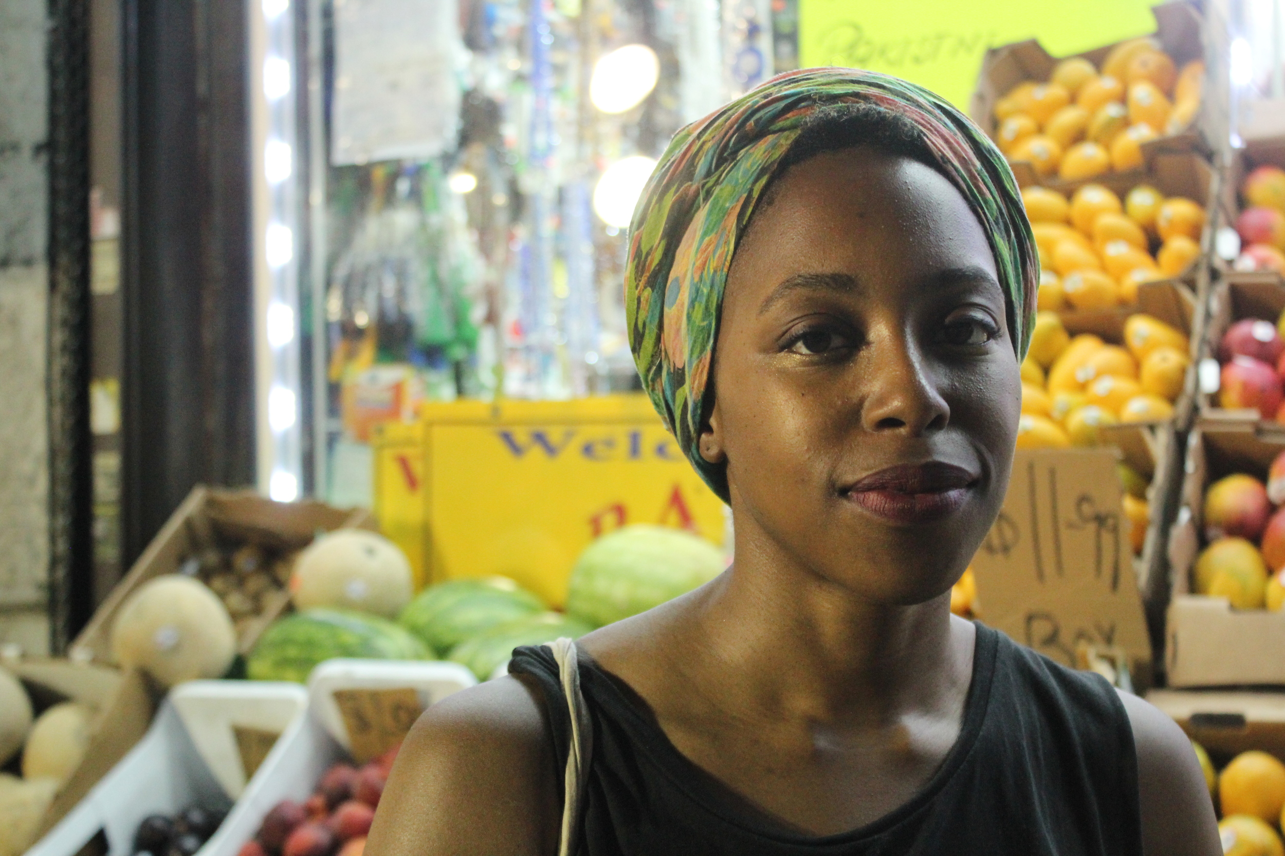
Fragmentario is a Brooklyn-based natural dyeing studio that offers custom dyeing services, an online store, and workshops on dyeing with mostly plant-based materials. Behind this operation is Maria Elena Pombo, who goes by Mari. Her boyfriend Griffin Moore (creator of tote bag line Native Outpost) is a frequent collaborator. "It's like we're each other's intern", Mari says. What was once a personal project is now an impressive, homegrown studio.
Mari recently invited me to the studio to attend a workshop called Garden of Delights: Dyeing with Avocado Pits, Onion Skins, and Flowers. After the workshop, I sat down with her to learn more about how it all began.

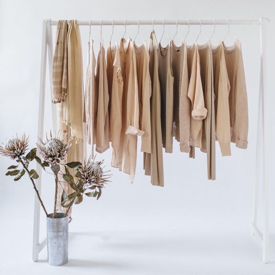
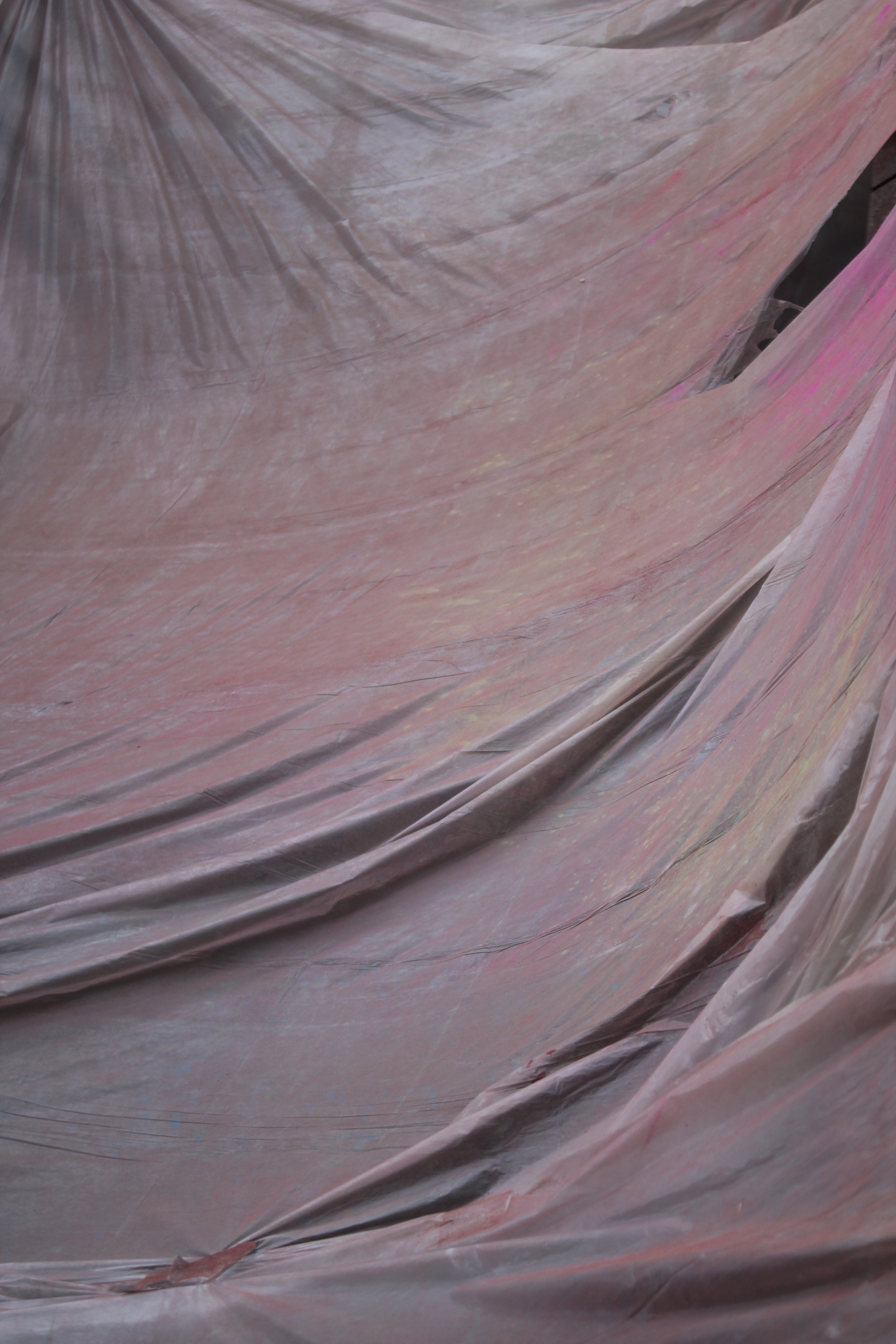
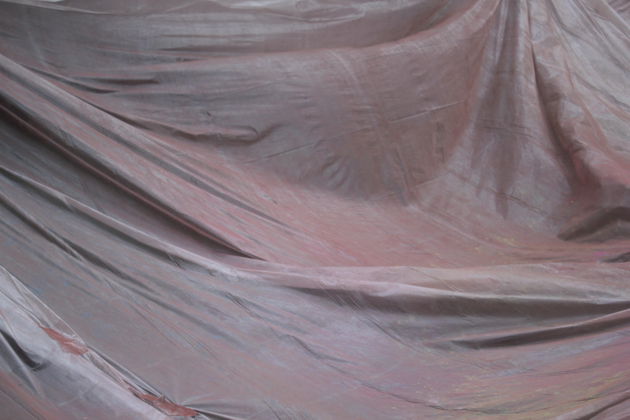
A t-shirt dyed with madder root. The spots come from iron remnants left in the dye vat.

Silk socks for sale in the studio.
When did you officially open the studio?
I would say 2016, since that is when I got the domain and was able to understand all the layers of the project. But I have been learning about natural dyes since 2014. I took my time to learn the skill and to understand how I wanted to use it.
Where does the name Fragmentario come from, and what does it mean to you?
When I started thinking about this project, my main concern was where it would fit in a larger context, beyond textiles and fashion. The slow food movement is very inspiring to me, as it has been successful in framing slowness under a positive light. I wanted to convey this idea of taking your time to do things right, as in, with natural dyes you cannot rush the process. There is a Spanish expression, "por partes" that roughly translates to English as “one step at a time”. I used an online translator to translate it into Galician, which is the native language of my paternal grandparents, and it interpreted it as fragmentario.
In Spanish, fragmentario means a collection of fragments or ideas. From the start, I had different sub-projects in mind so it was a fitting word in both languages, as well as easily understandable in English. I also liked the idea of using my grandparents’ language. They migrated from rural Spain to Venezuela in their twenties and would speak in Galician between each other, keeping it as their own secret language. It brings back good memories.
I love that!
Me too. It's funny, they would also do it so the grandchildren didn't understand them when they were talking about giving us chocolate ... but we all understand it to a point because it's very similar to Spanish.

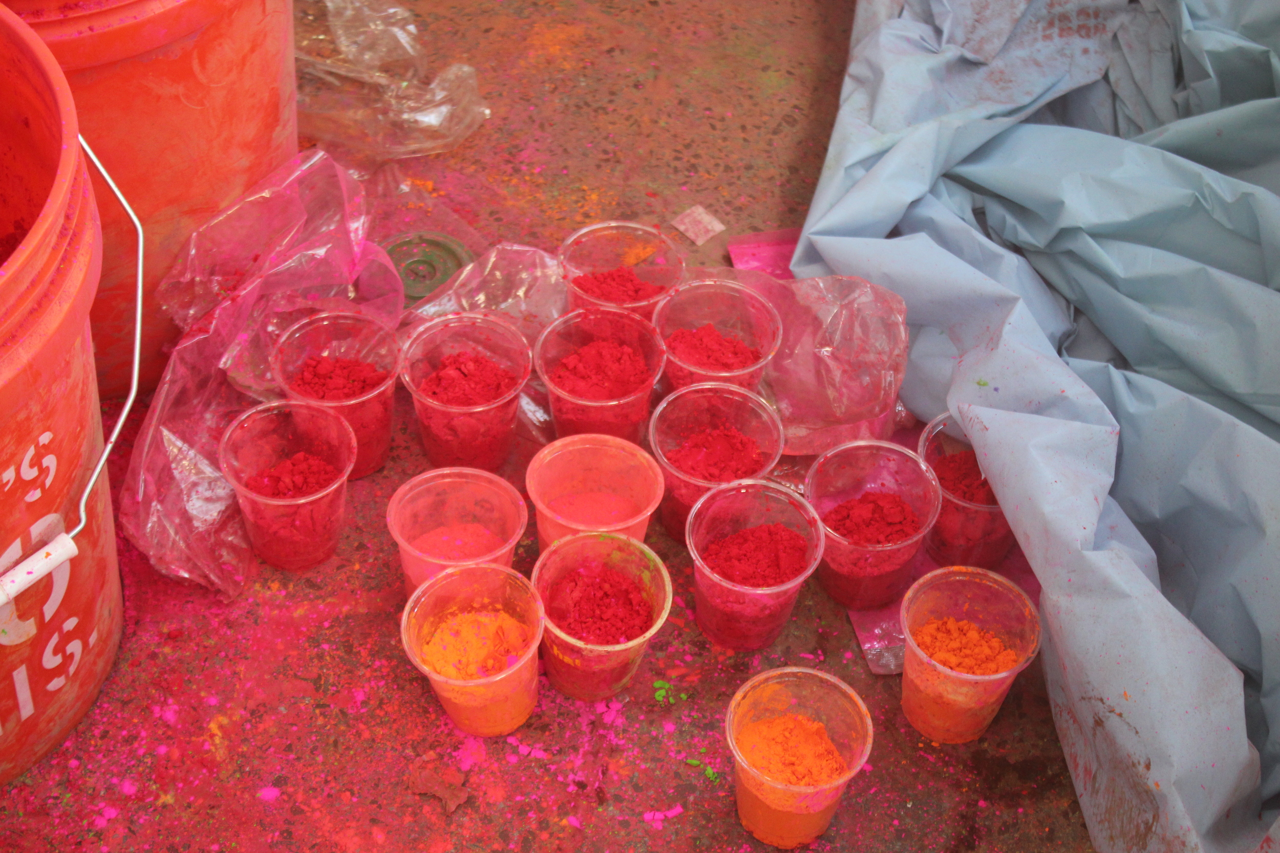
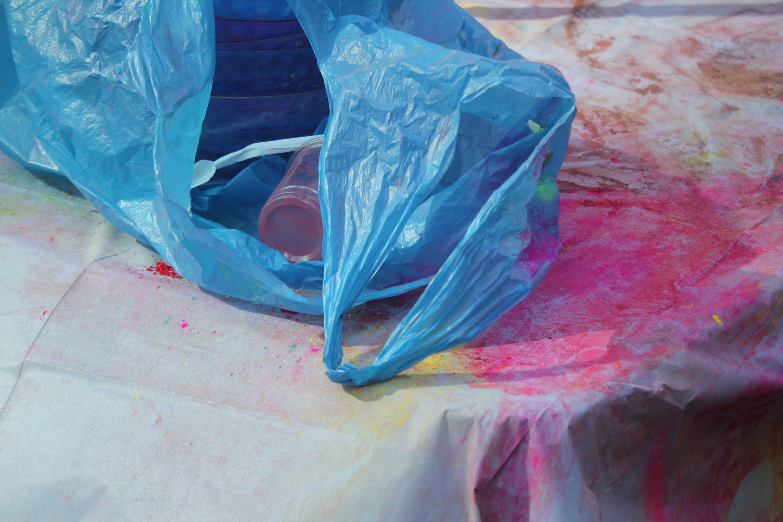
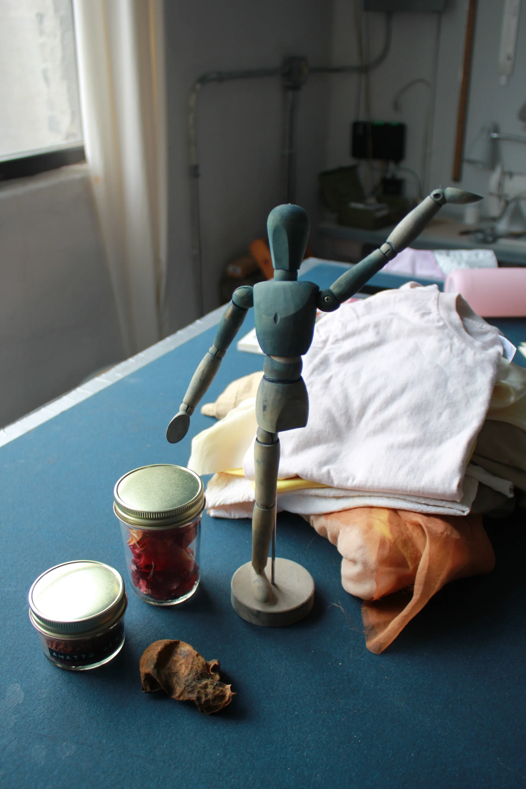
Students preparing t-shirts for tie-dye. The jars contain commonly used materials--cochineal, annatto, and cutch.
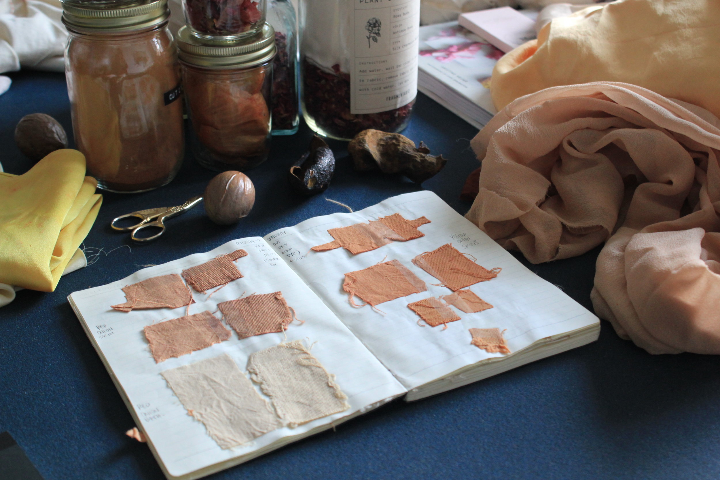
Some of Mari's early dye samples.


After graduating from Parsons, you worked for various fashion companies. What made you want to transition away from that and start your own studio?
I would always work on projects over the weekends, while having a day job, focusing first and foremost on honing my skills. After becoming more comfortable, I gave the project a name and started showing my work. Opportunities started to arise, and people were approaching me for more commissions and workshops than I had time for. At the same time, the company I worked for was undergoing a restructuring process, and my heart was not set on their new projects. These two things combined made it seem like a good time to focus my energies on Fragmentario.
Before fashion design, you studied engineering. How has that training shaped the way that you work now?
Working with natural dyes is like working in a lab. There are many variables that can affect the result. Some are obvious: the dyestuff and the concentration used. But others are less evident: the composition of the fabric, the acidity of the water, or the material of the container used, just to name a few. Having a background in engineering is helpful because I can understand things within a scientific context.
I also have friends from my engineering school days who are chemists. I go to them for advice on process and safety. I was very scared of using mordants, because there is a lot of conflicting information on how dangerous they are. Having people I trust help me determine safety procedures was a big relief.


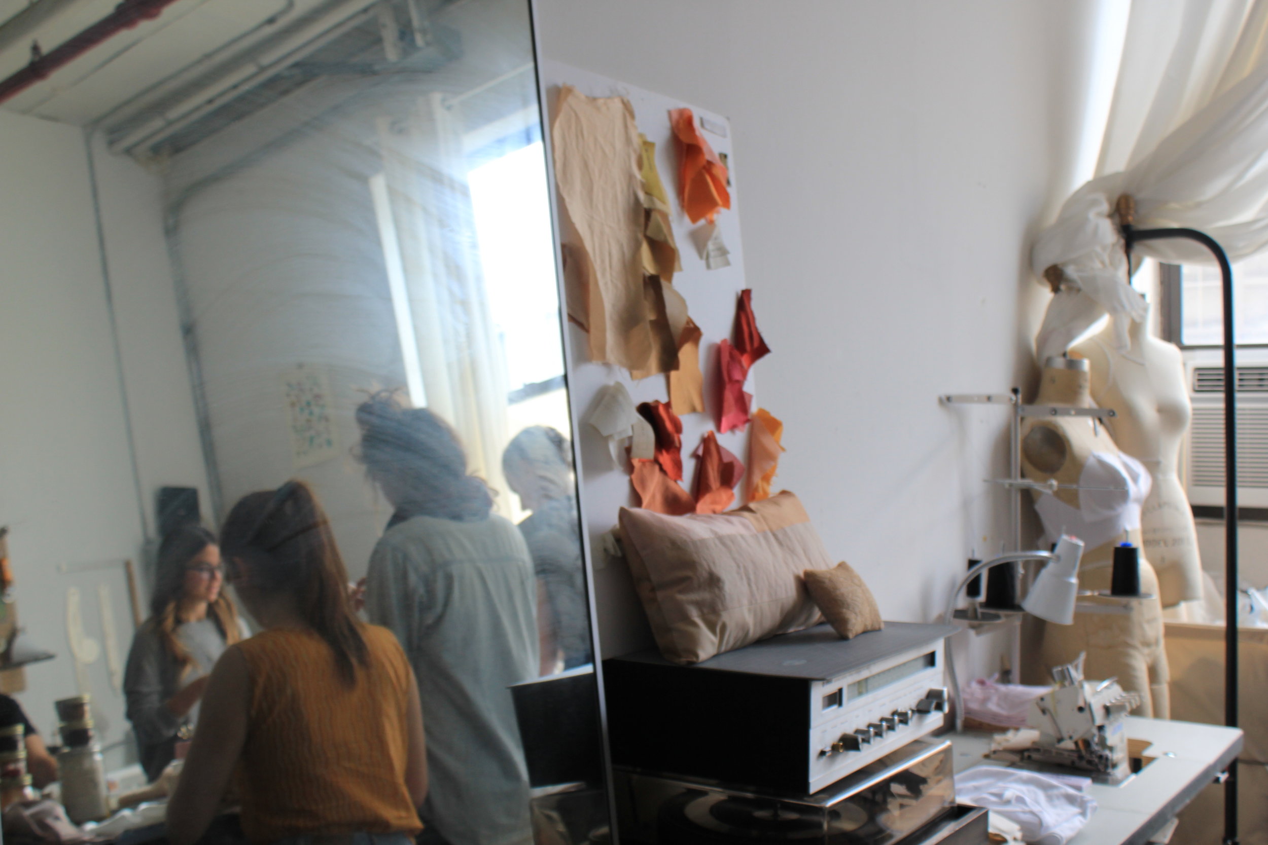
One of the items for sale in the online shop.

Avocado pits, softened from heat. The dye derived from them is a pale, pretty pink.
How would you describe Fragmentario's color aesthetic?
I favor design that focuses on the process and the materials. I try to develop rich colors that are not what is expected when thinking of 'natural dyes'. When people see my color book they are always shocked that these are all made with natural sources. I like keeping this element of surprise and helping others visualize natural dyes in a modern context, not as a thing of the past.
The idea of working with natural color came from your boyfriend Griffin. During the workshop, you mentioned that you were initially resistant to the idea. Why do you think that is?
I expected the colors to be very subtle because most literature says you need to use mordants, which to me made the whole process less magical. [Note: A mordant is a substance used to set dyes on to fabrics, intensifying the color]. Luckily, that same week we had a trip planned to Griffin’s parents' home in Western New York, so we didn’t have time to order any mordants. We brought some fabric and got onion skins from the supermarket, and we just tried it without mordanting the fabric first.
The colors were so beautiful just with the onion skins that I was instantly hooked. After obtaining the brown tones we were looking for for Native Outpost, I started trying to achieve other colors with avocado pits, turmeric, and cinnamon and found the same result: mordants were not necessary. I still work largely without mordants and all the workshops are conducted with only plants. I feel the easier you make it seem, the more people will want to try it at home.
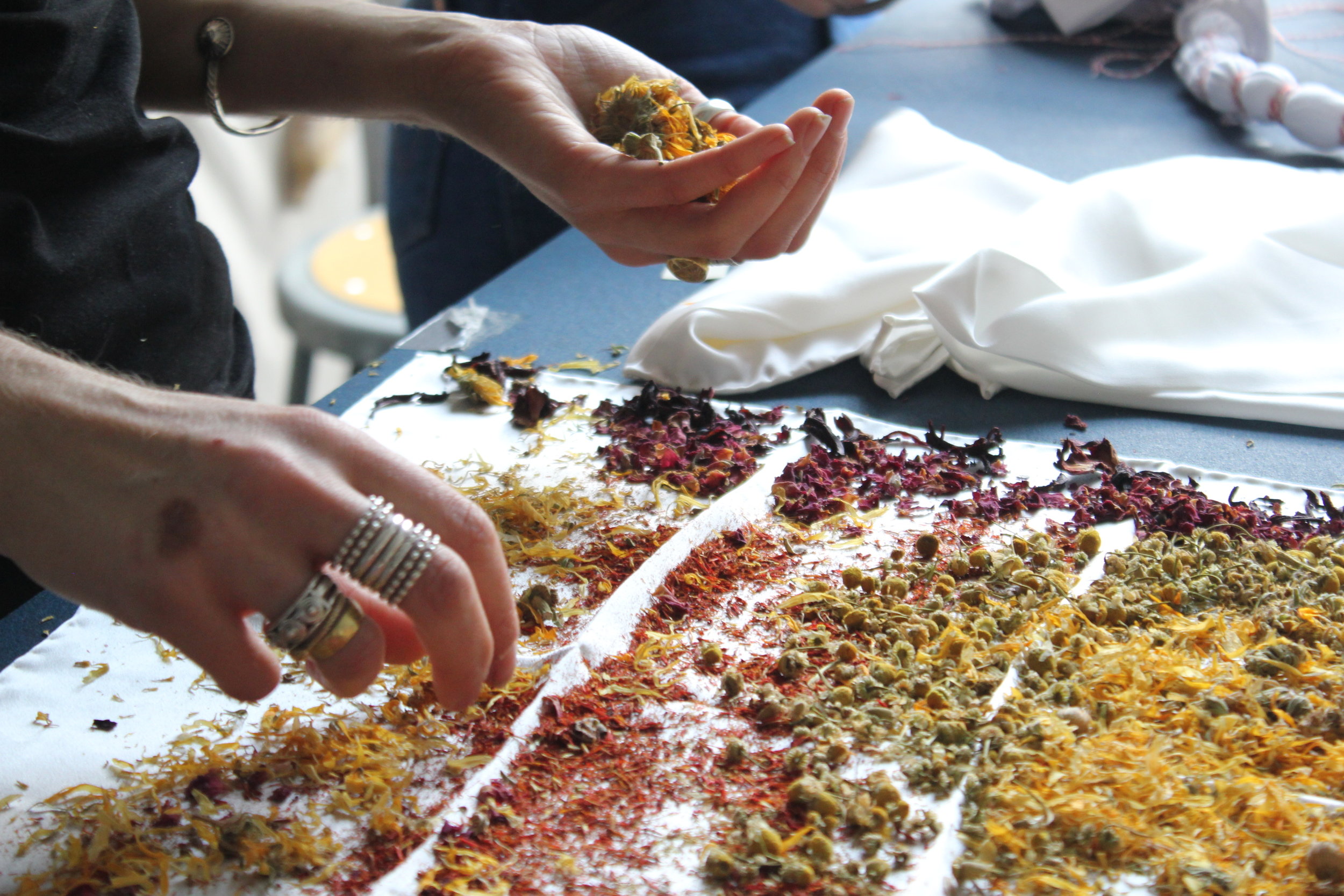
Arranging dried marigold, rose buds, safflower, chamomile, and hibiscus for a flower bundle. These give off a lovely scent while stewing in the dye vat.


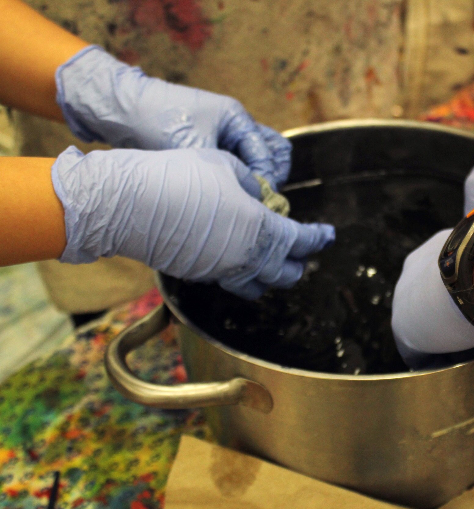
Natural dyeing takes time, so we took a break to eat together and talk.


What are some of the pitfalls of natural dyeing? Any dyeing disasters you want to share?
One of the pitfalls of natural dyeing is that it can be hard to replicate an exact color. I have come to appreciate this as it makes each process unique, but for commissions it can be hard. Sometimes people approach me with a specific Pantone color in mind, and I have to explain how the process works and that I can aim to get a similar color, but cannot guarantee making it exactly the same.
I have ruined fabrics from using too much heat. Silk is very sensitive and should not be boiled to a high temperature, as this will make the hand “peachy.” Before learning this, I once used a lot of heat for dyeing around 5 yards of silk, thinking this would help get a deeper color, but ended up with a very dull finishing instead.
On a more positive note, any happy accidents?
I have had many happy accidents, but my favorite came one time I was trying different dyeing materials on jars with no heat. I had a powdered extract from a tree and it did not dissolve in the water. Some particles adhered to the fabric and a pattern was created by accident. I loved the result (see Mari's photo below).


Mari's color book, where she documents the results of dyeing with various fabrics, temperatures, and lengths of time.
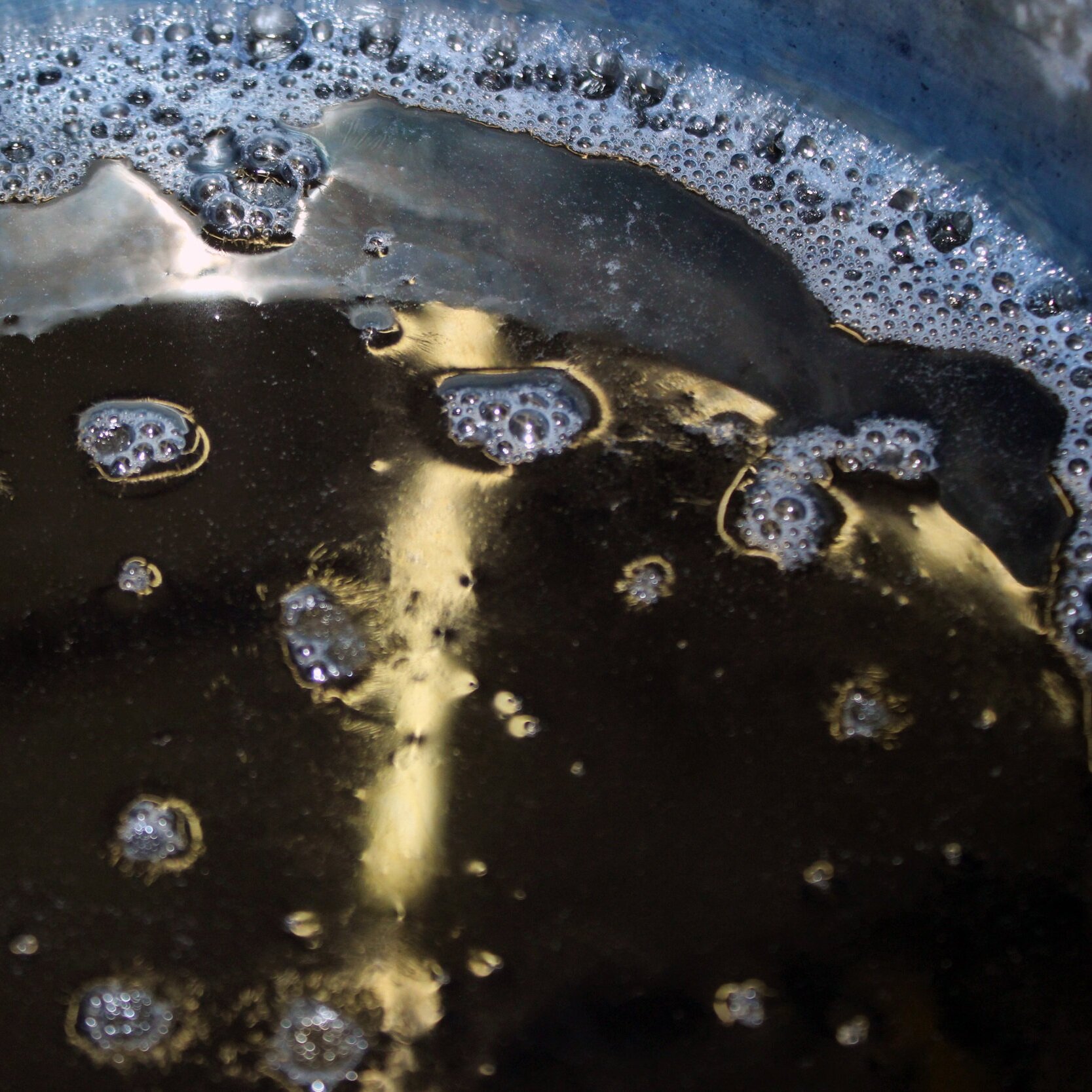
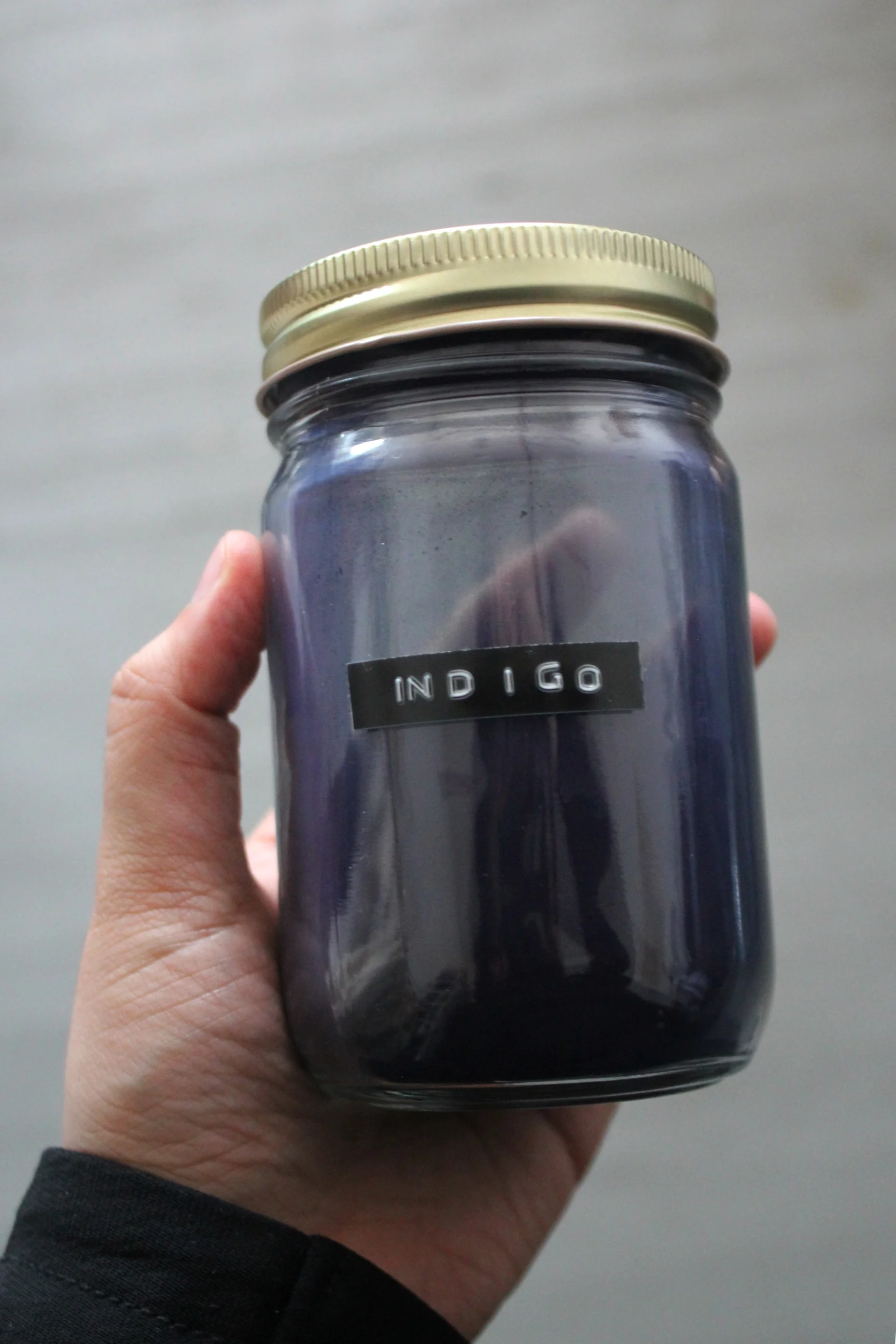
Indigo on wood.

What is the most satisfying part of the dyeing process for you?
I love sharing knowledge, especially with people who have no clue about natural dyes. You can see their bewilderment when shown the colors that are possible with plants, particularly onion skins and avocado pits because they are easily identifiable and usually regarded as waste.
Who are some of the interesting people you've come across in your teaching workshops?
The workshops attract a very diverse crowd, from textile artists looking to further incorporate natural dyes to their work to human rights activists who are interested in the intersection of creativity and sustainability. The people who come to the workshops are seemingly very different, but they all have similar interests and worries.
What have you learned from them?
My take-away from the attendees is that there is a rising group of diverse people who care about where their objects come from and how they are made, which is very inspiring.

If you could give one piece of advice to those who want to start their own creative business, what would it be?
Starting a creative business or project is an endurance race, not a sprint. You have to be consistent and manage your energy from the beginning, as to not over-exhaust yourself to a point where you cannot keep going. It is hard to draw boundaries when you are your own boss, but it is important, as rest and downtime help you become more efficient. I have a very hard time with this myself, but I try to make time to reassess my goals and understand my project in a larger context.
One step at a time. Thank you, Mari!